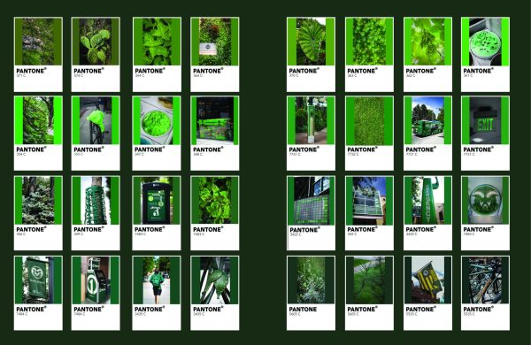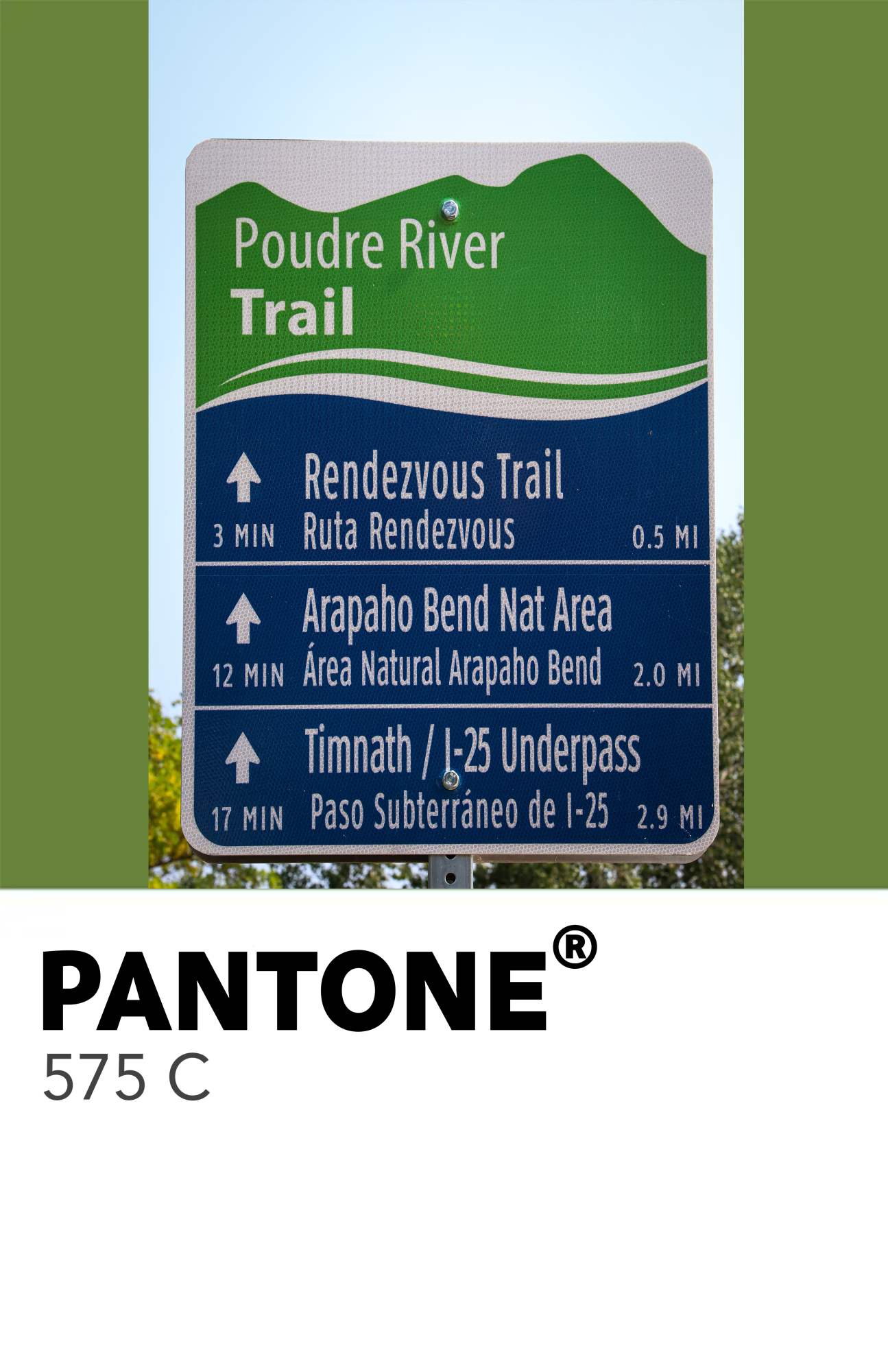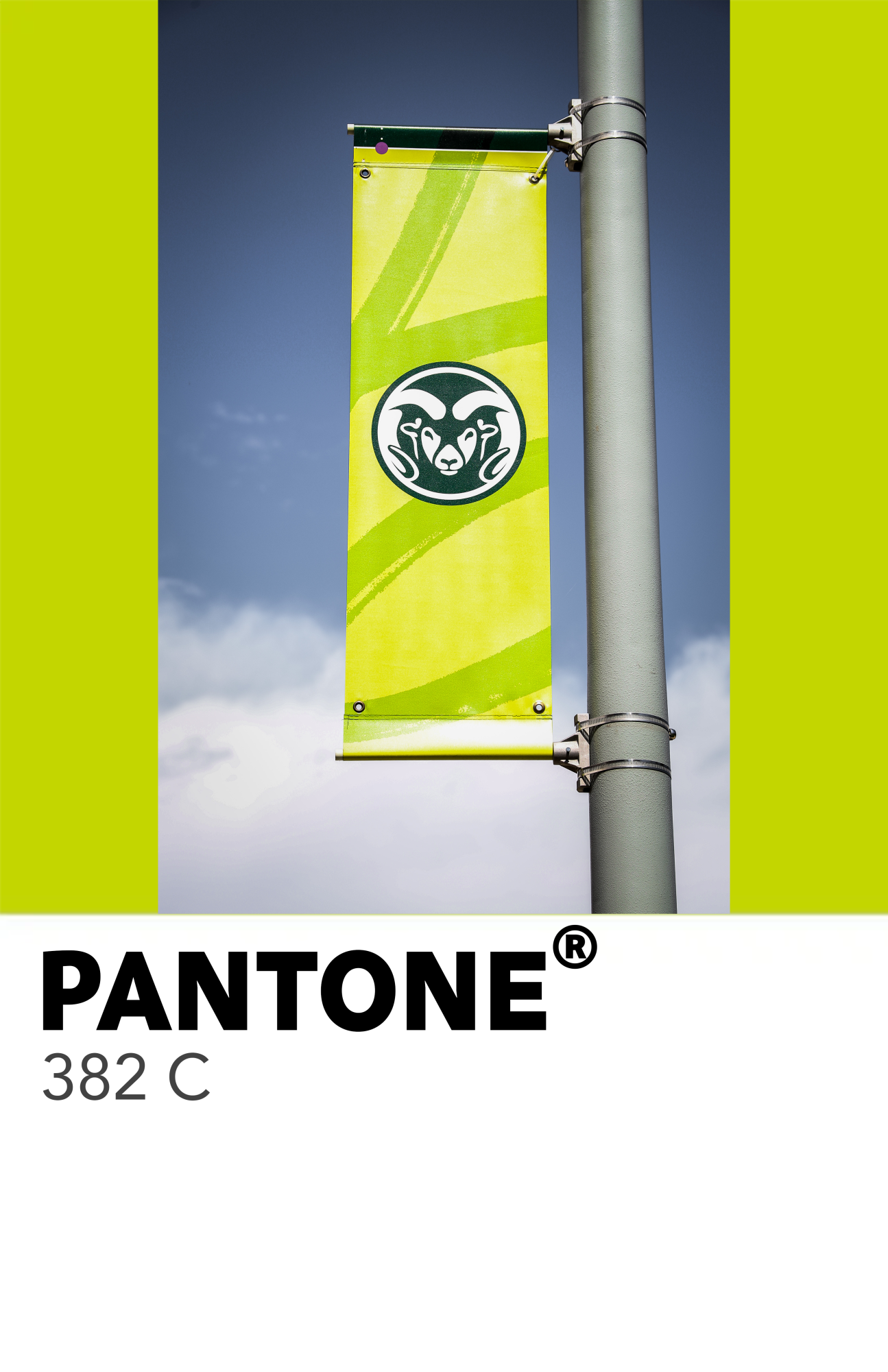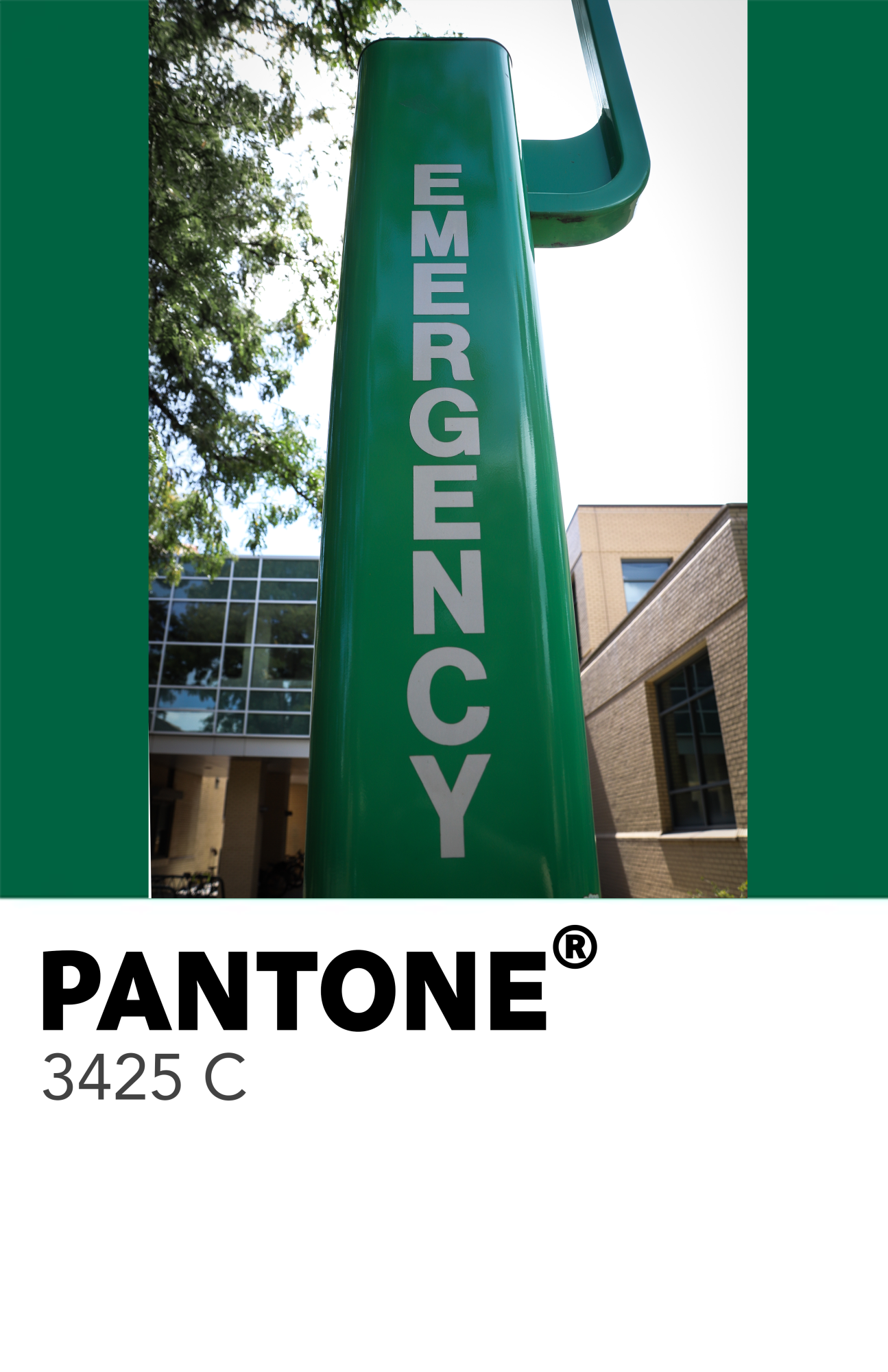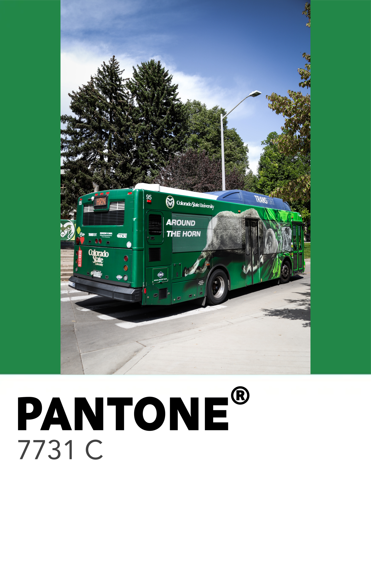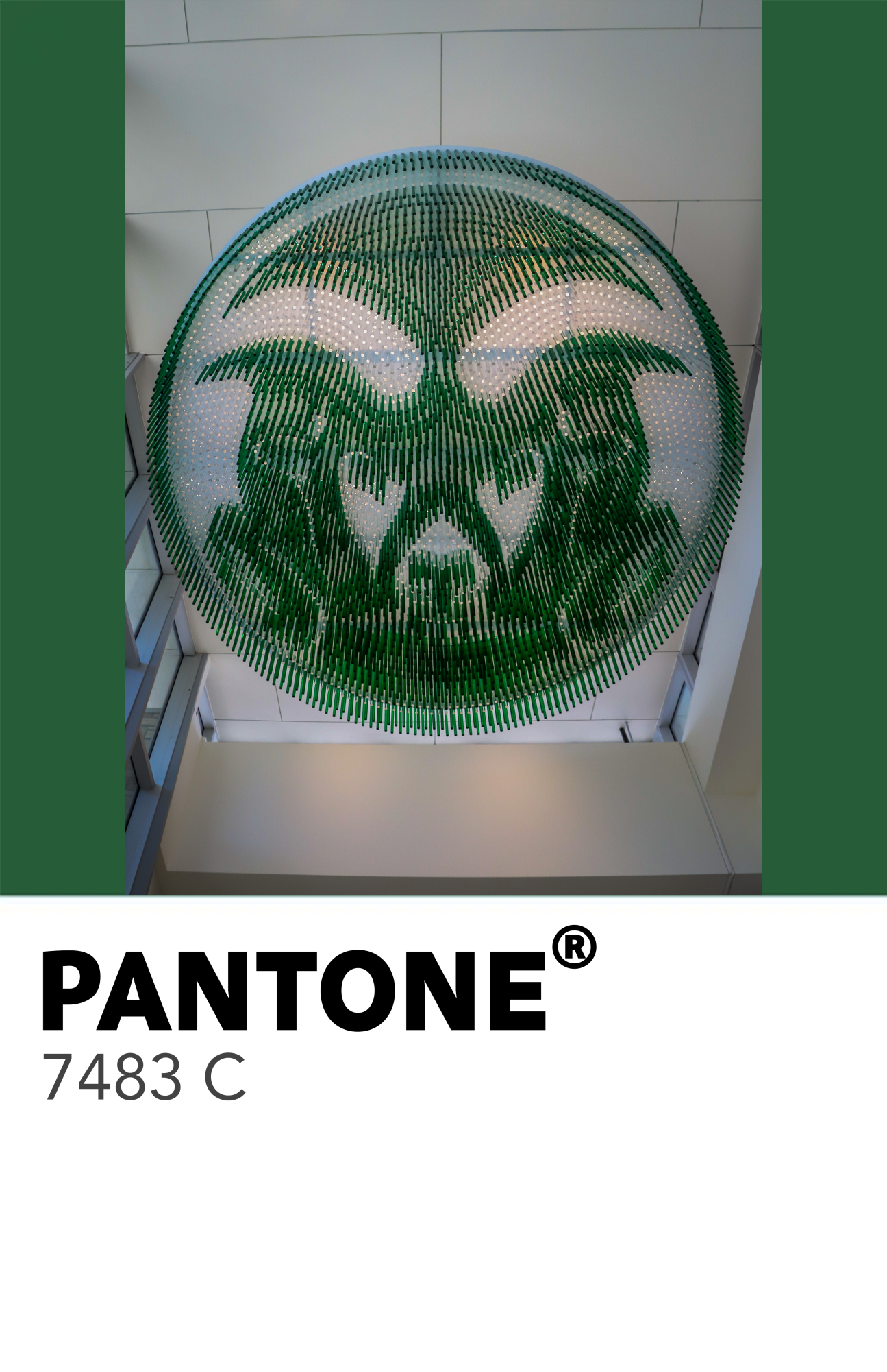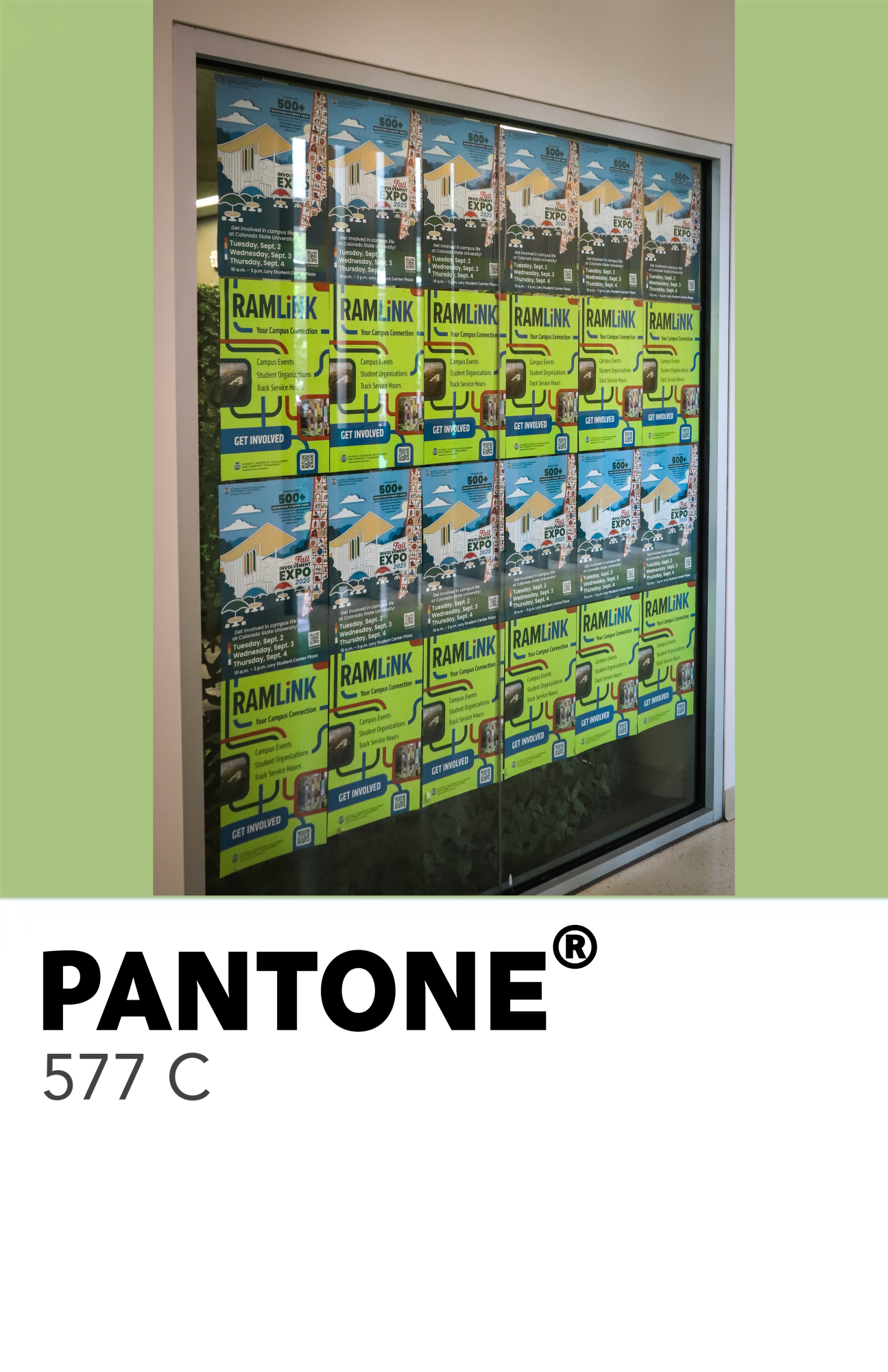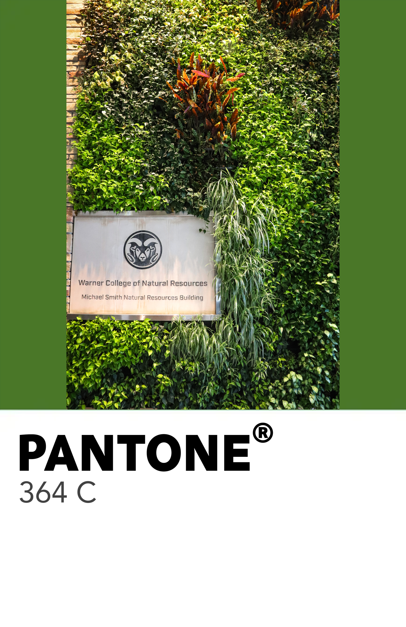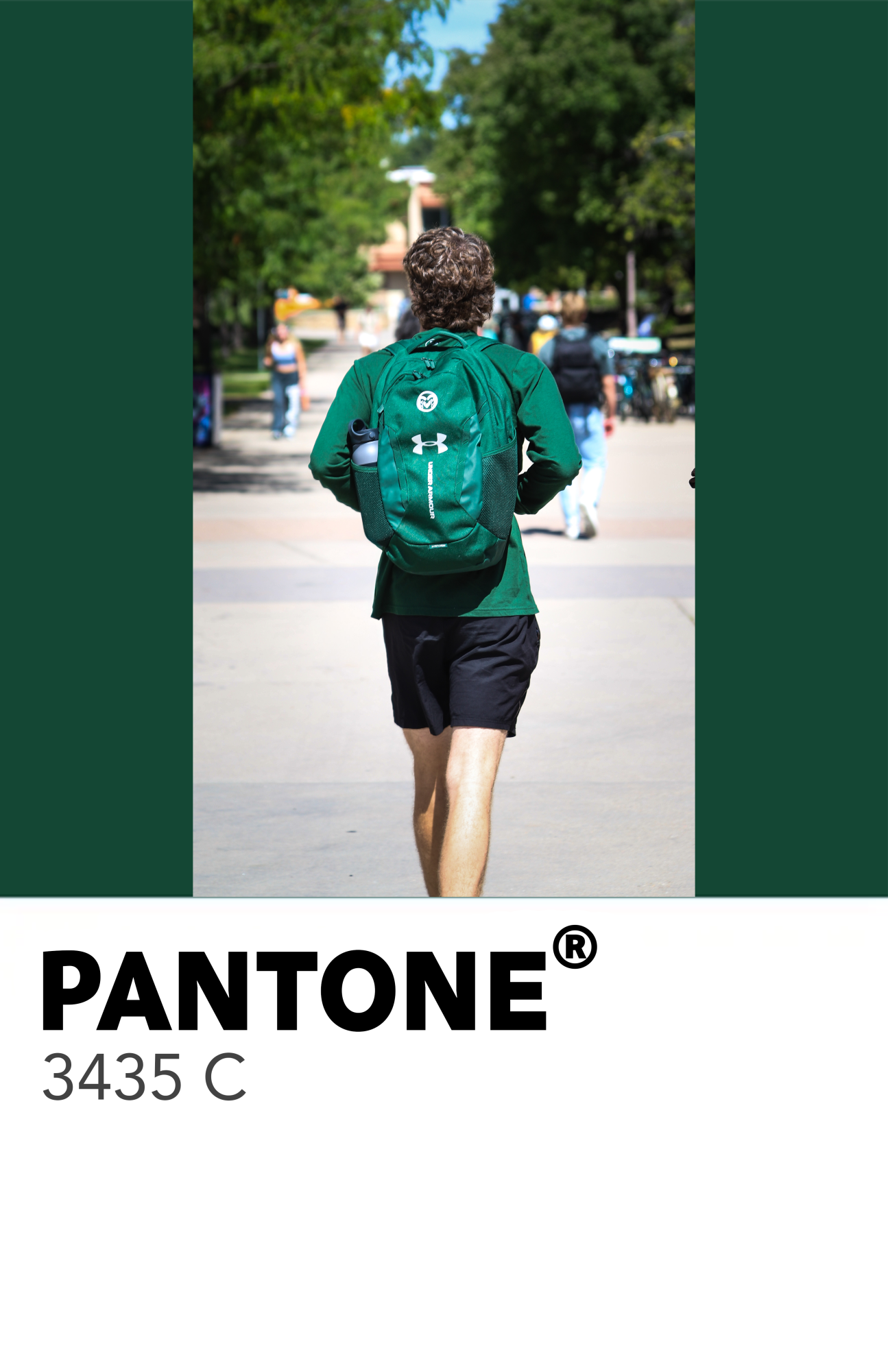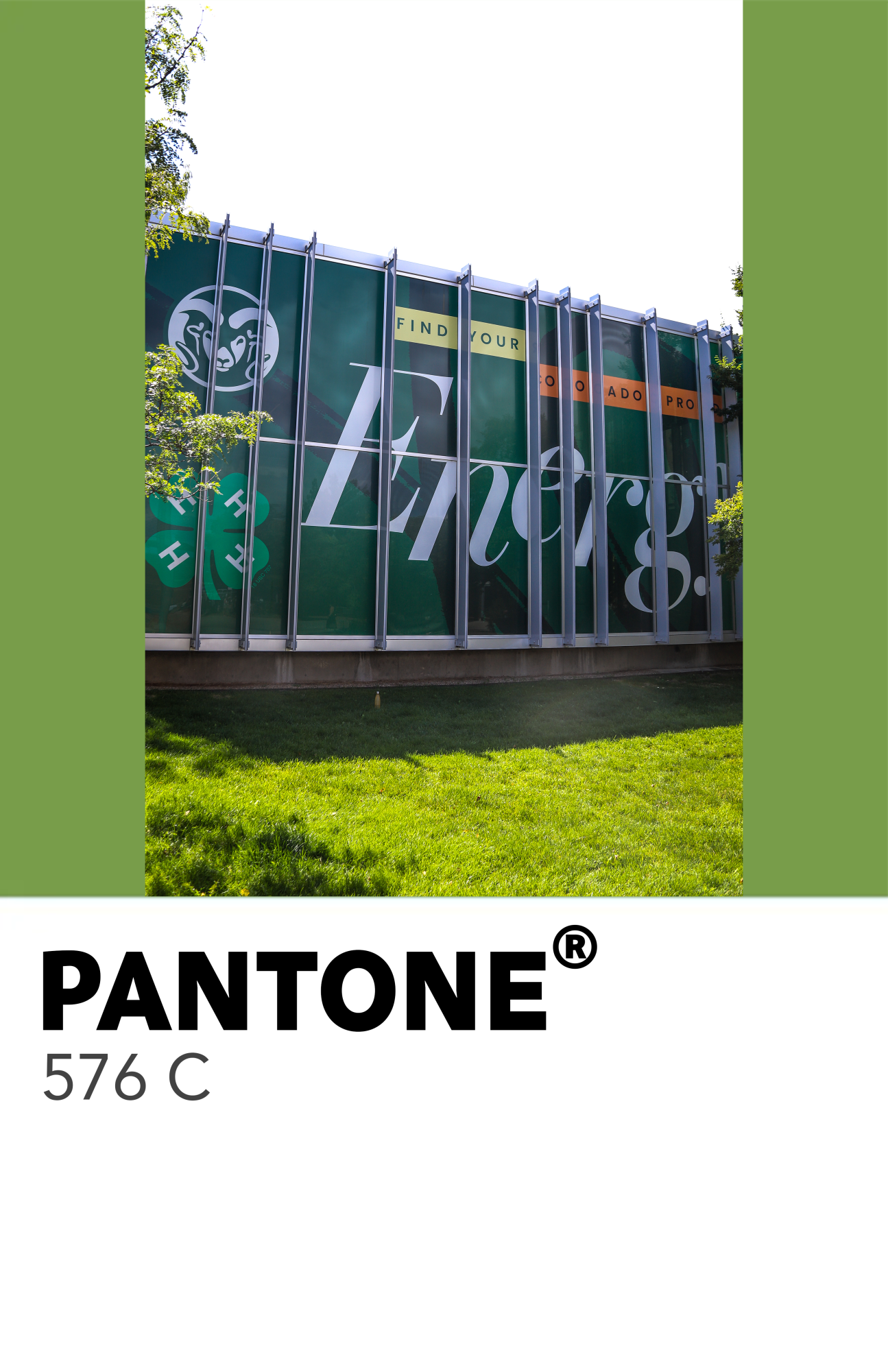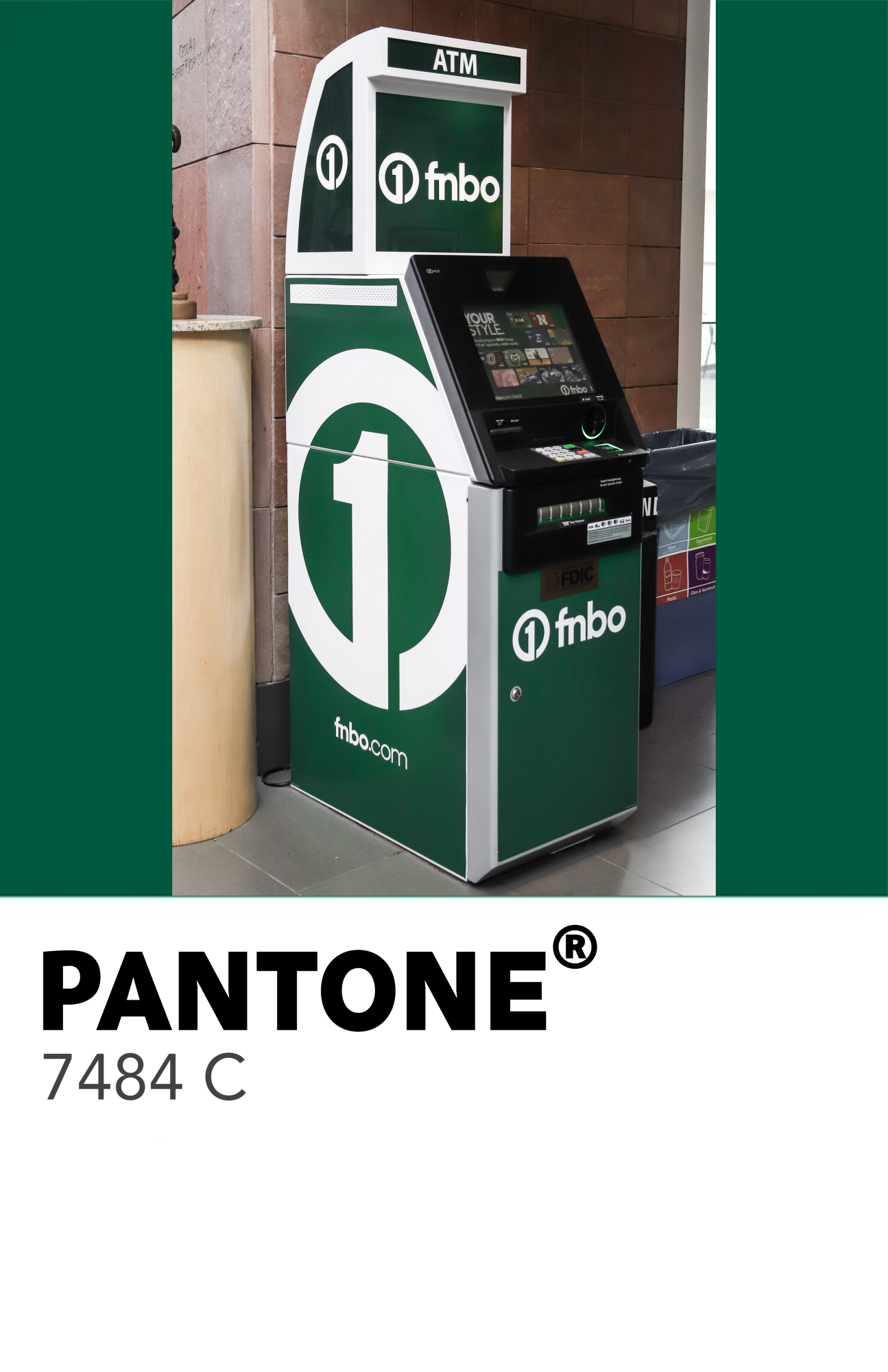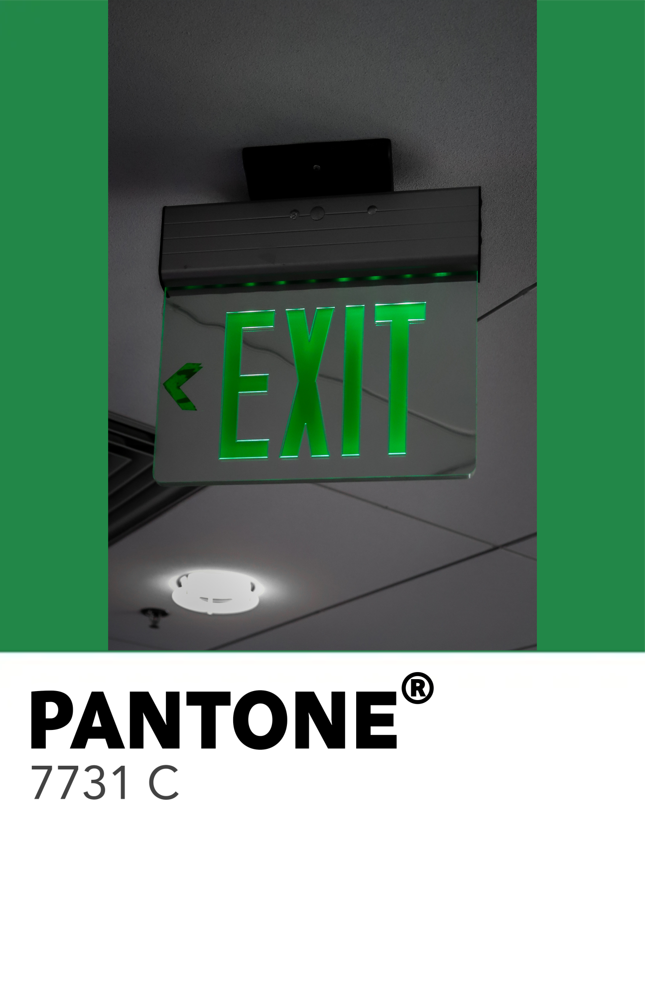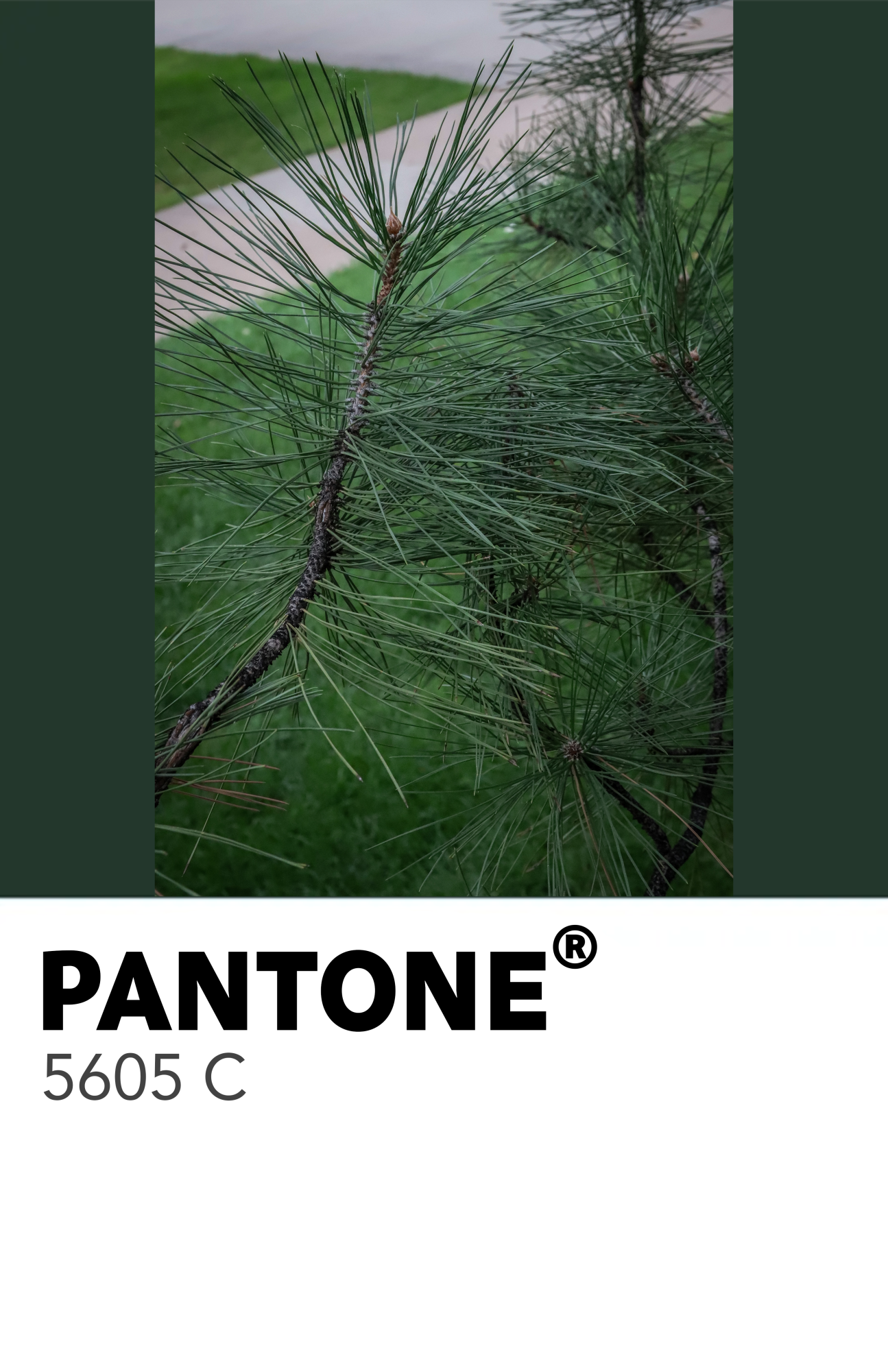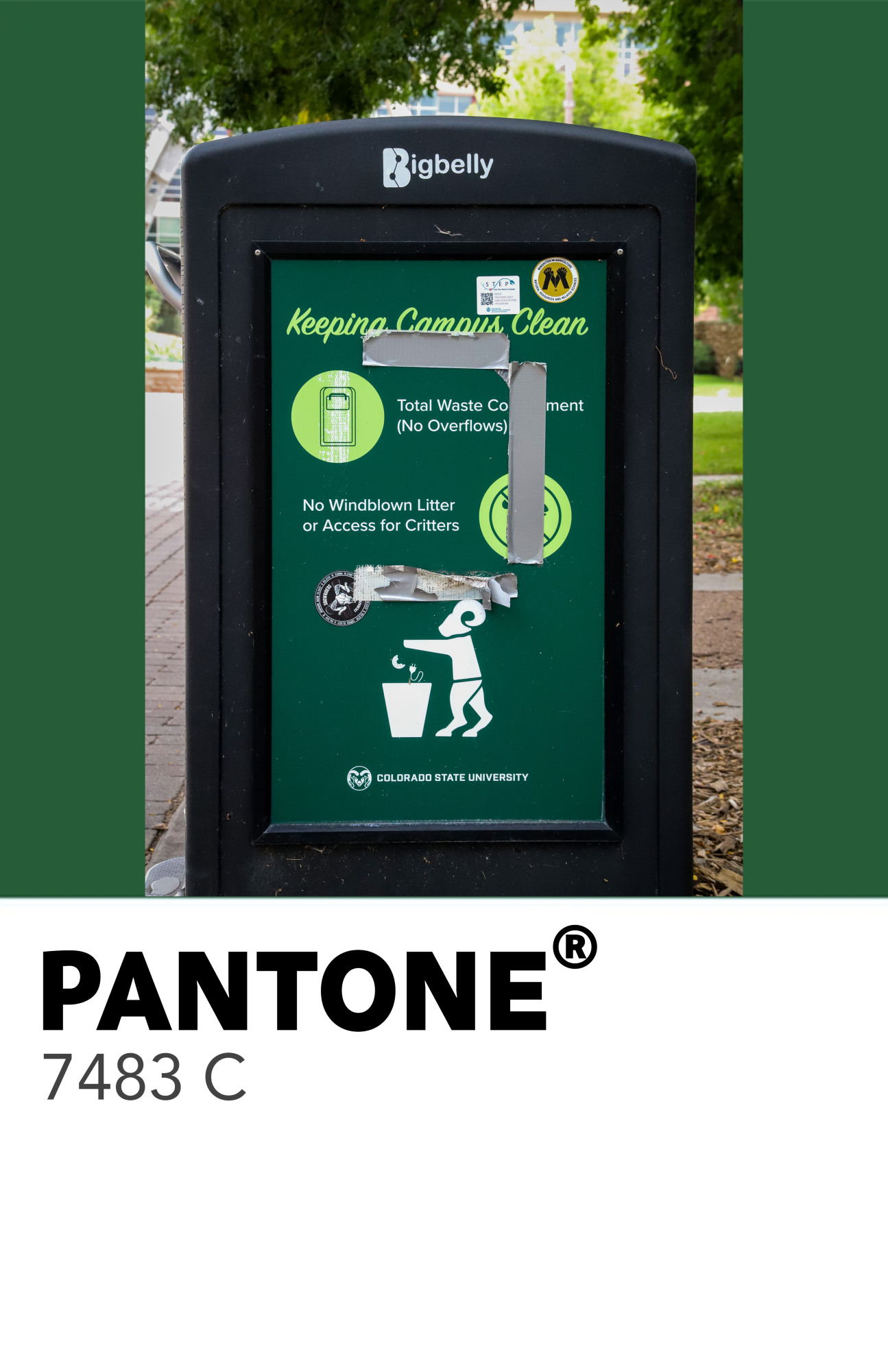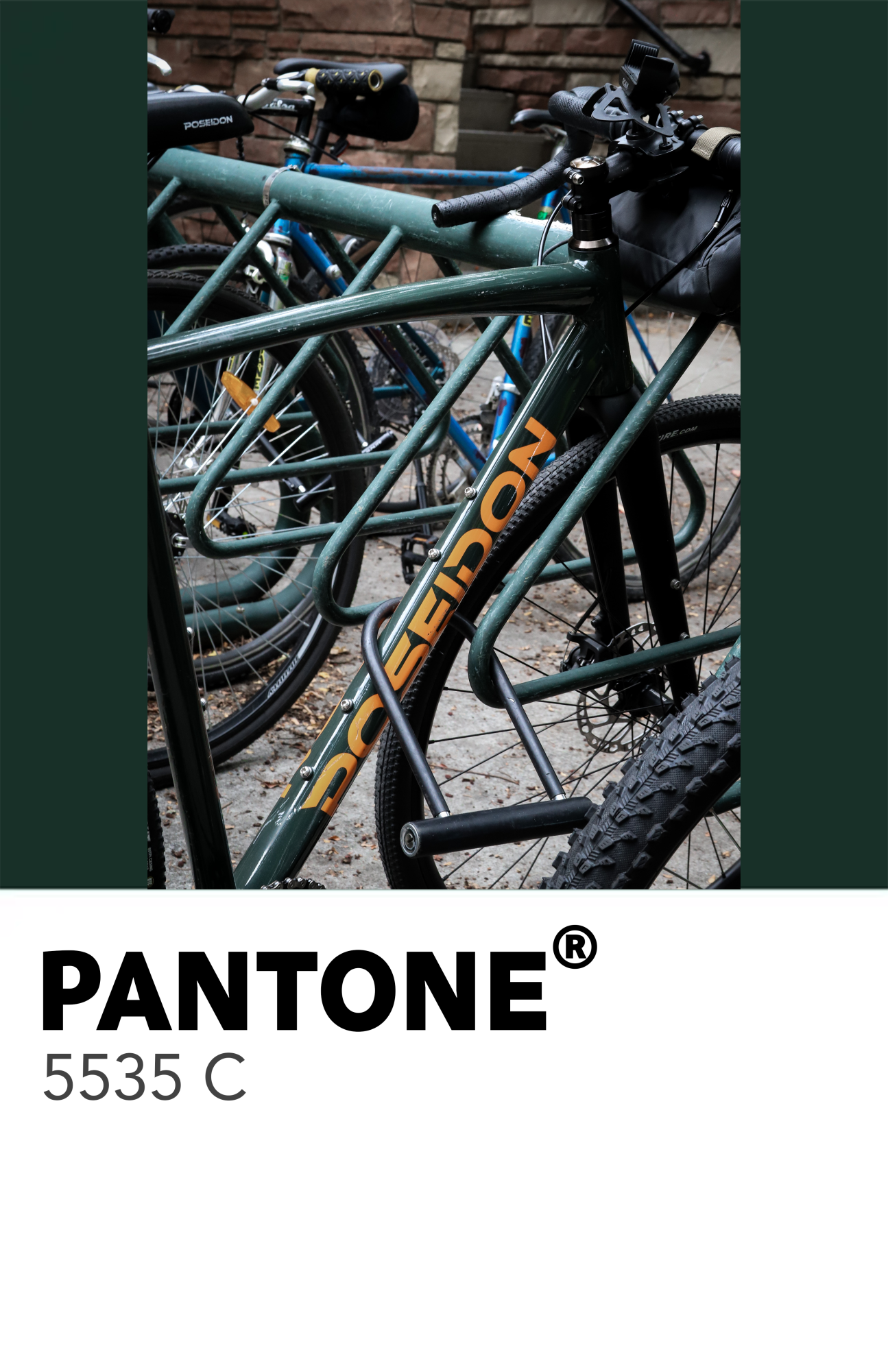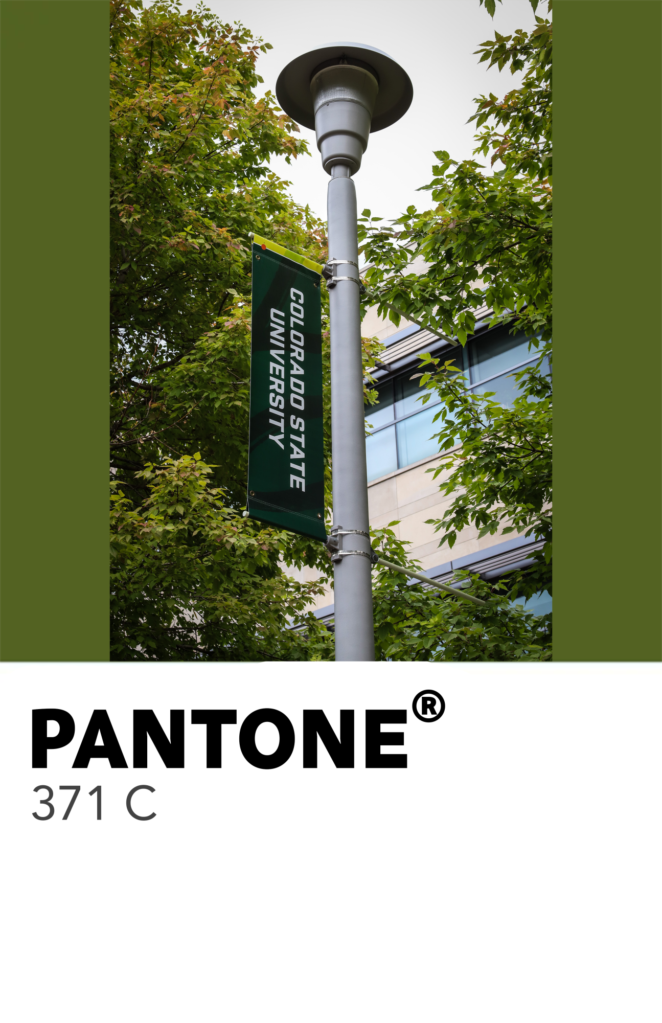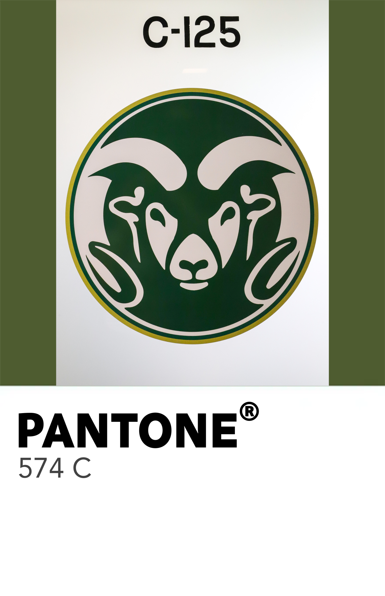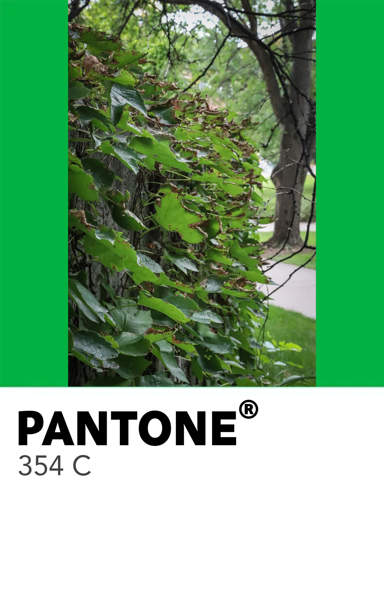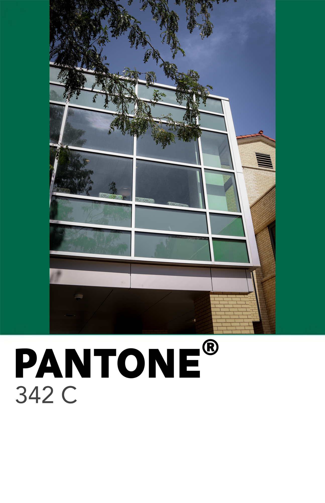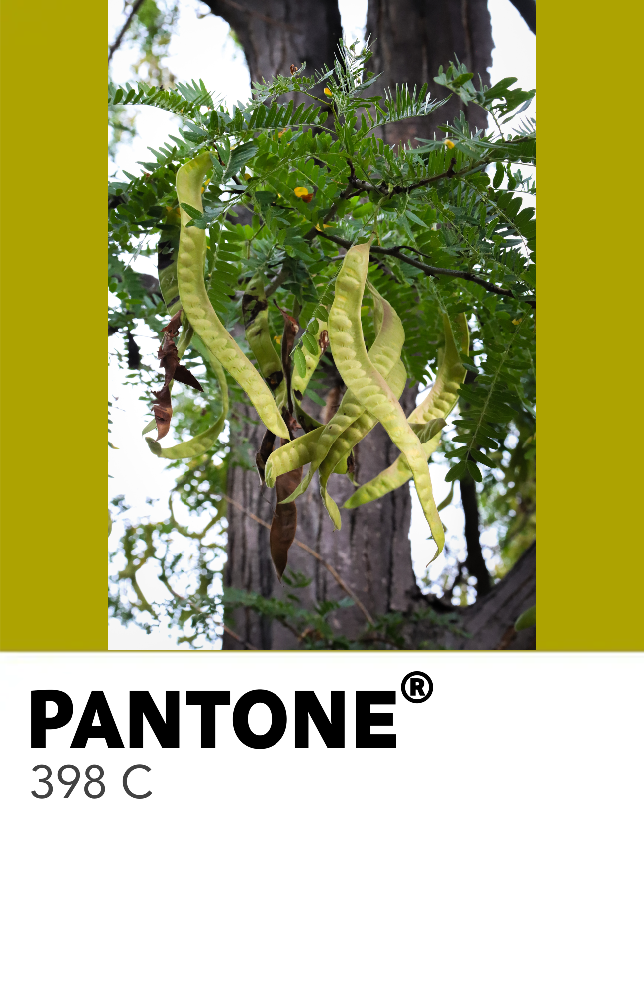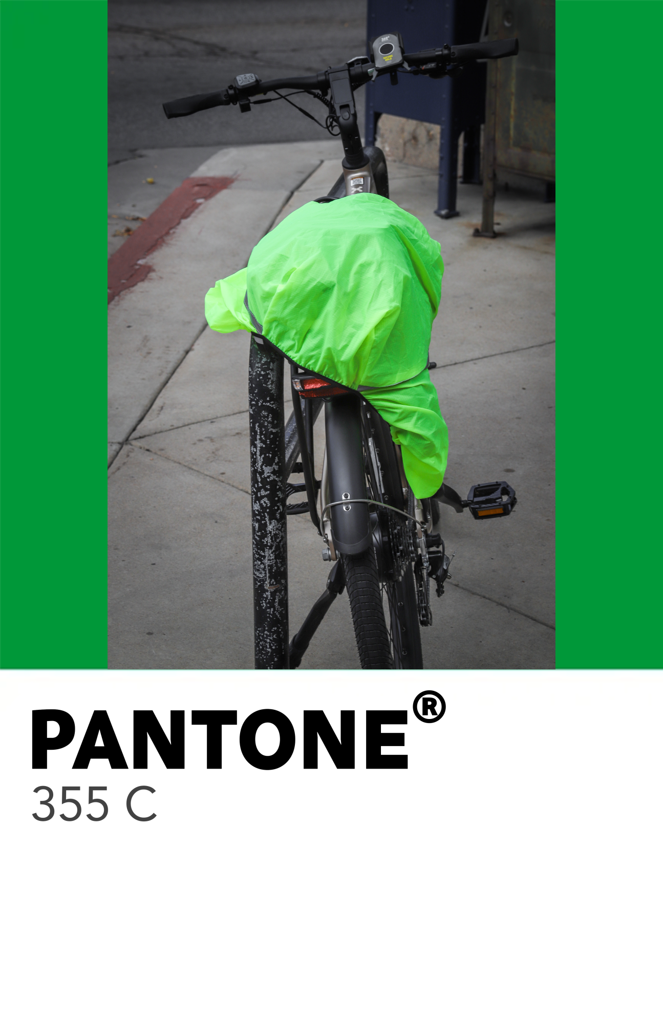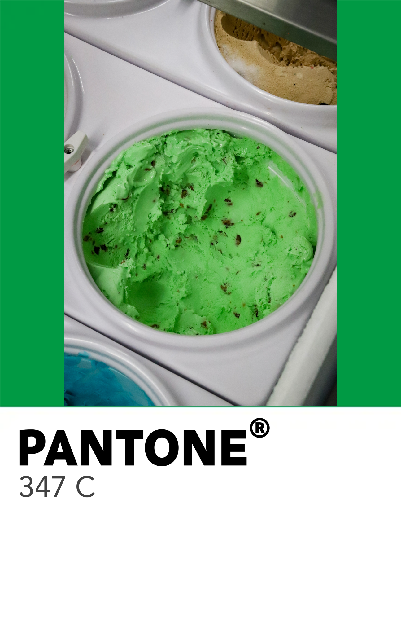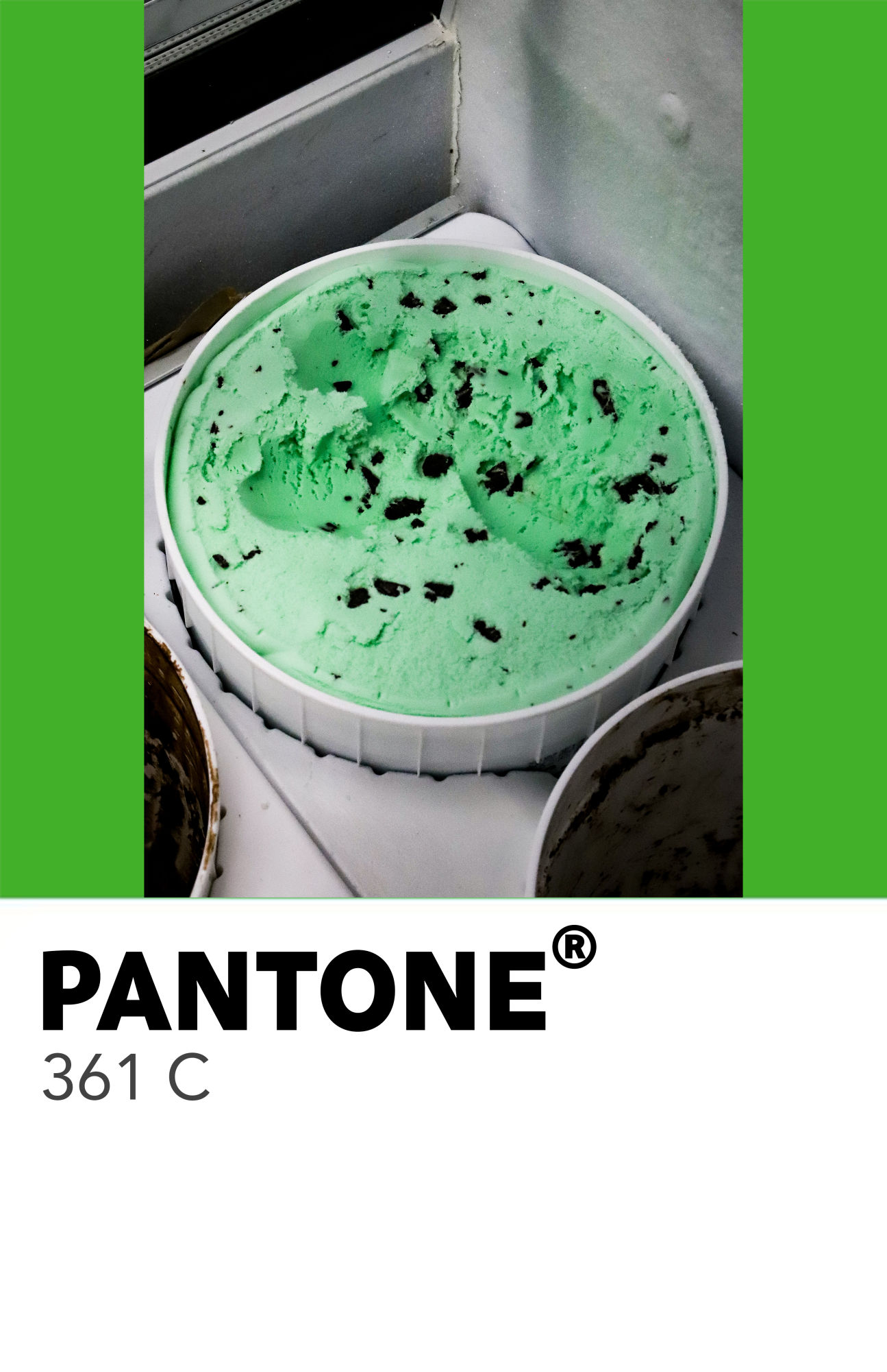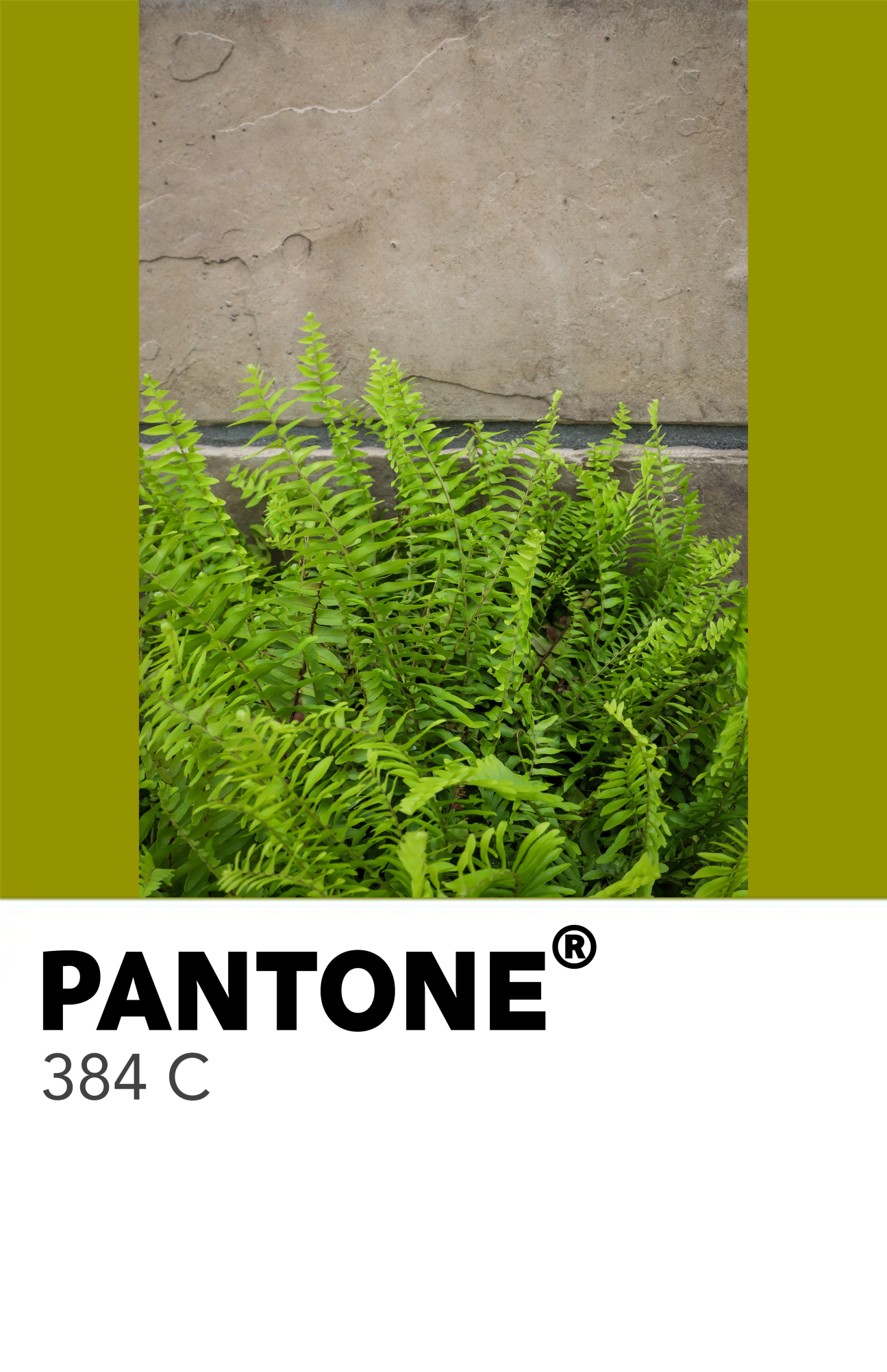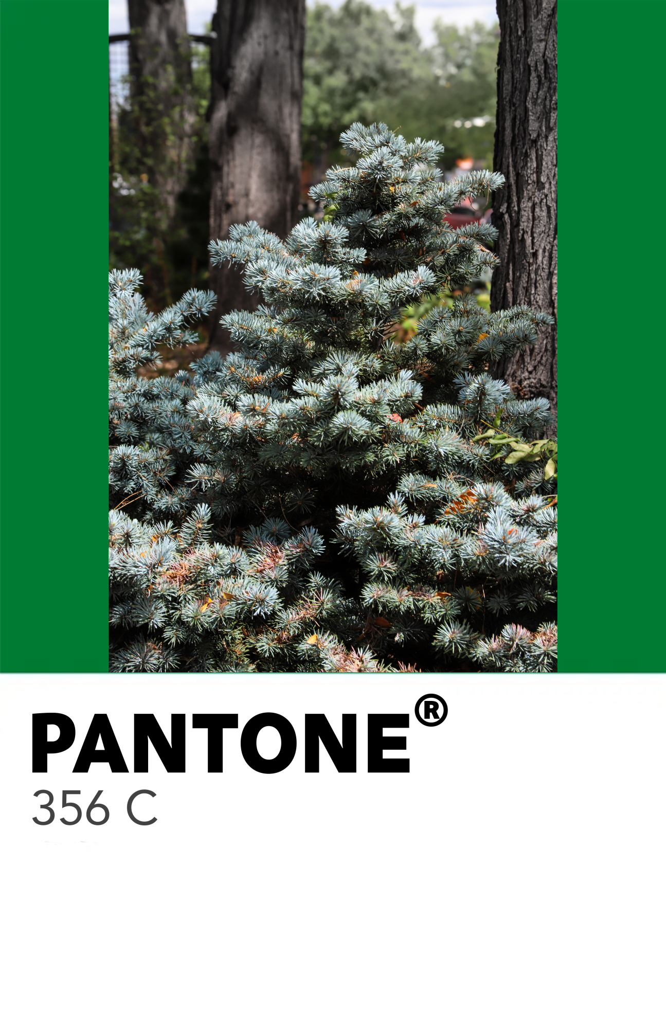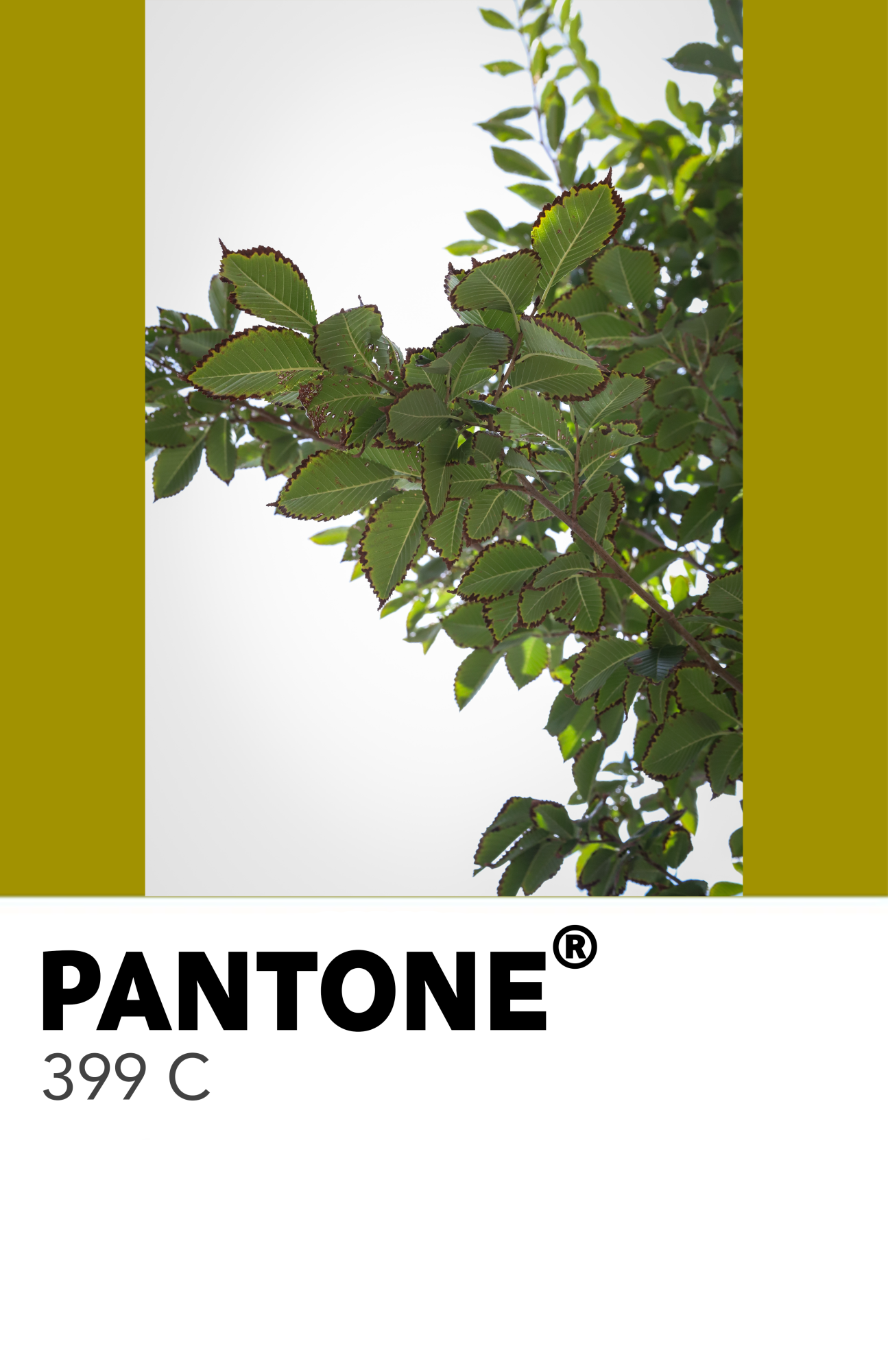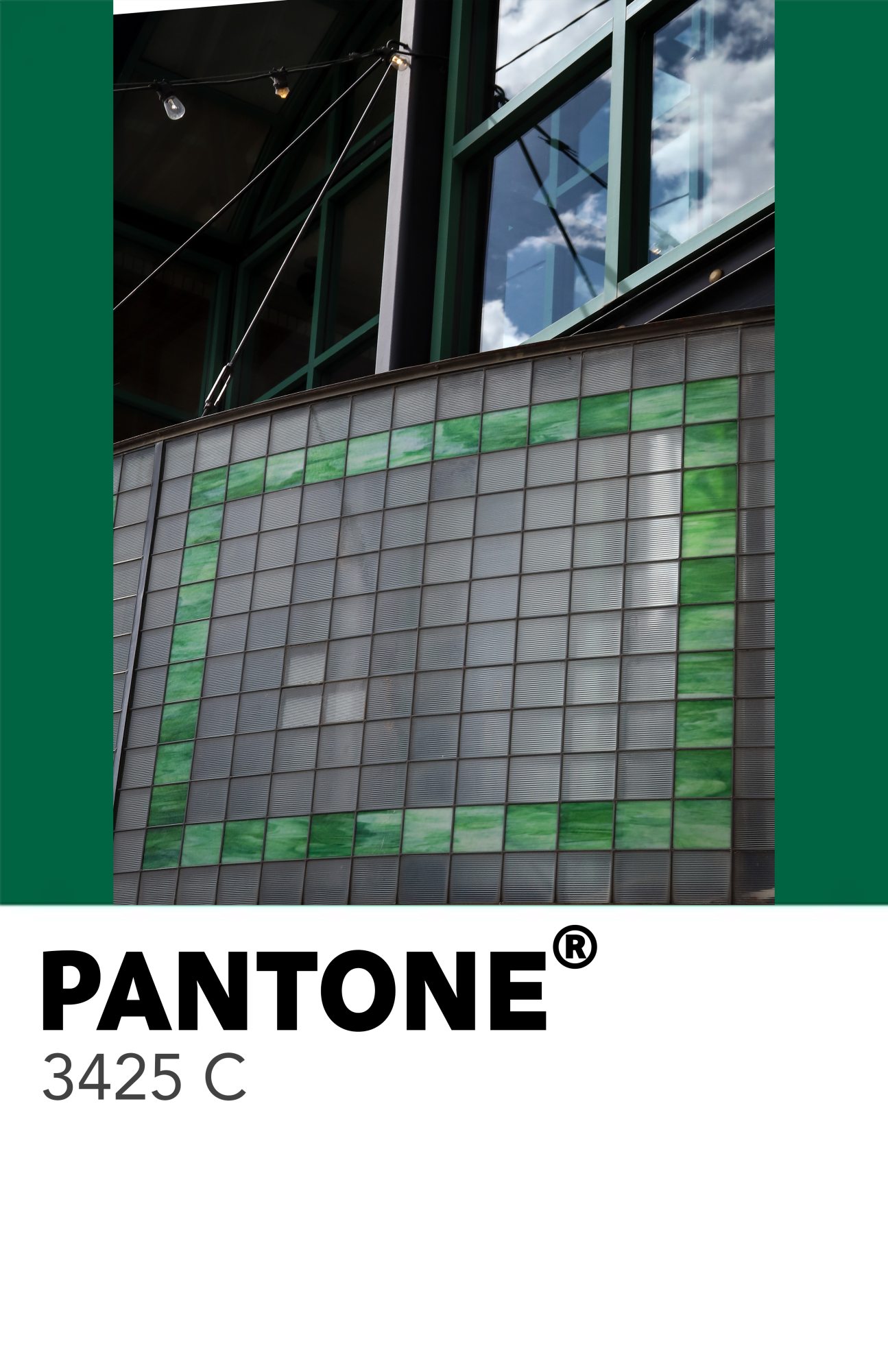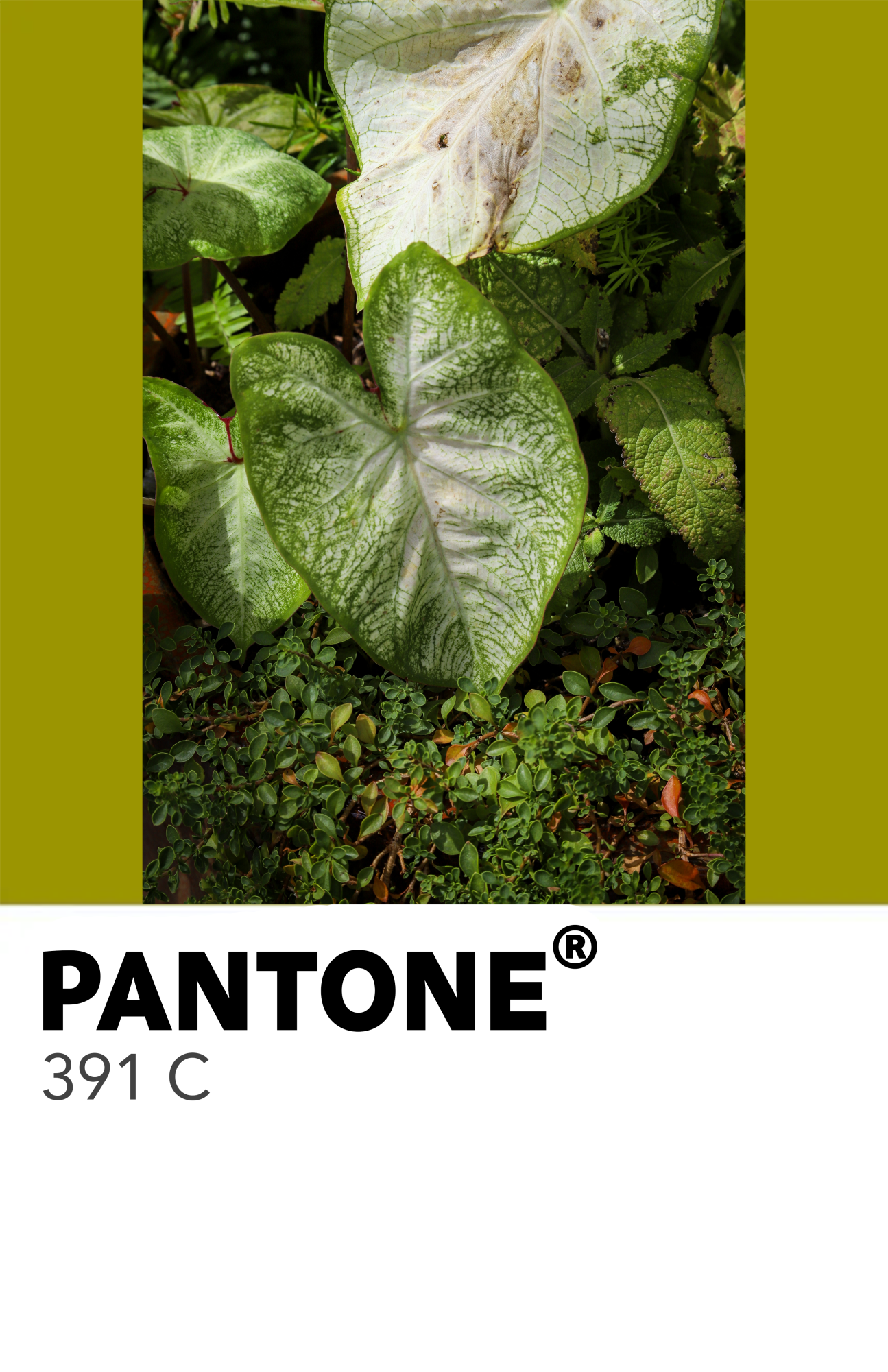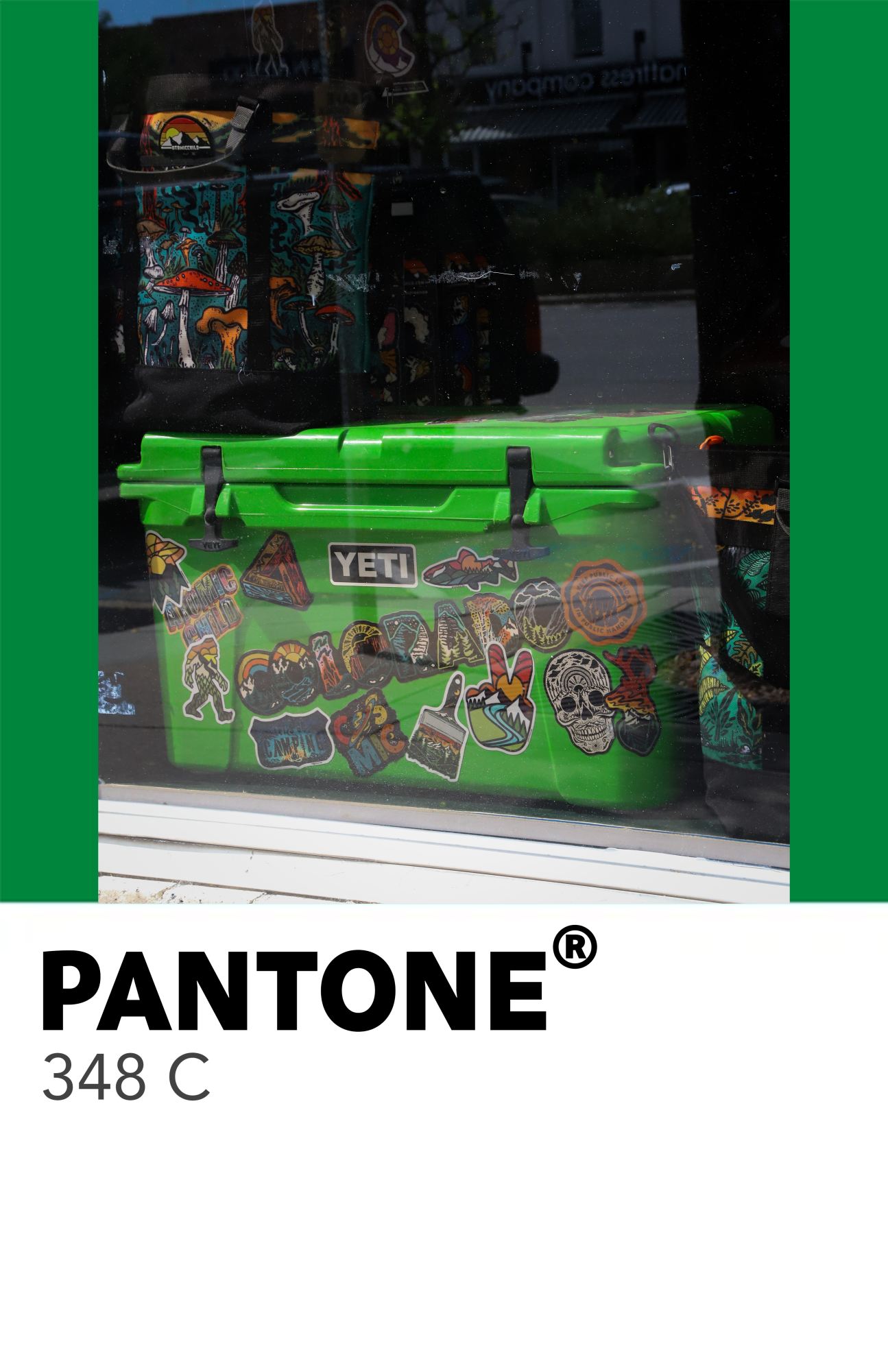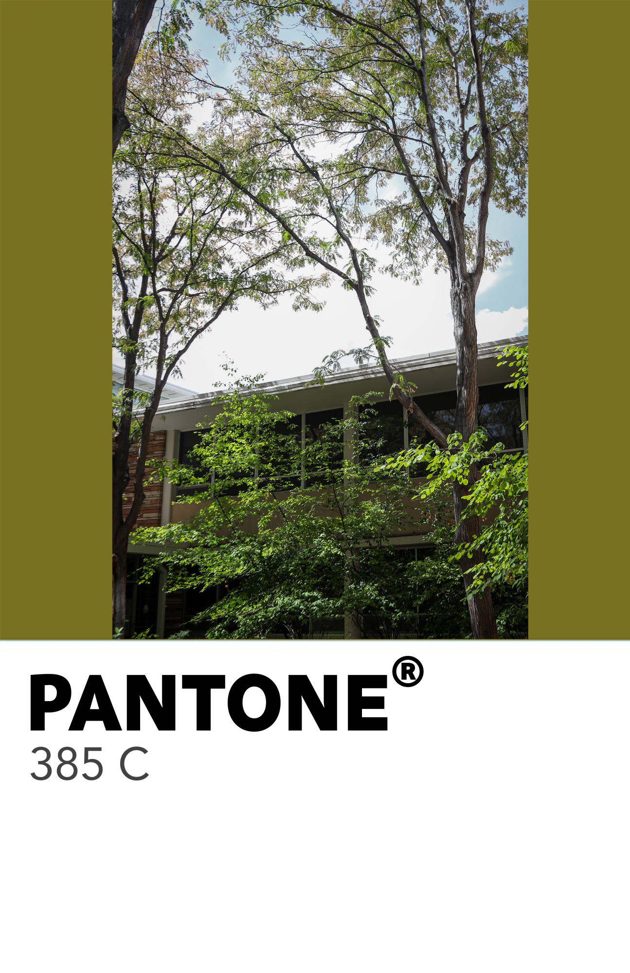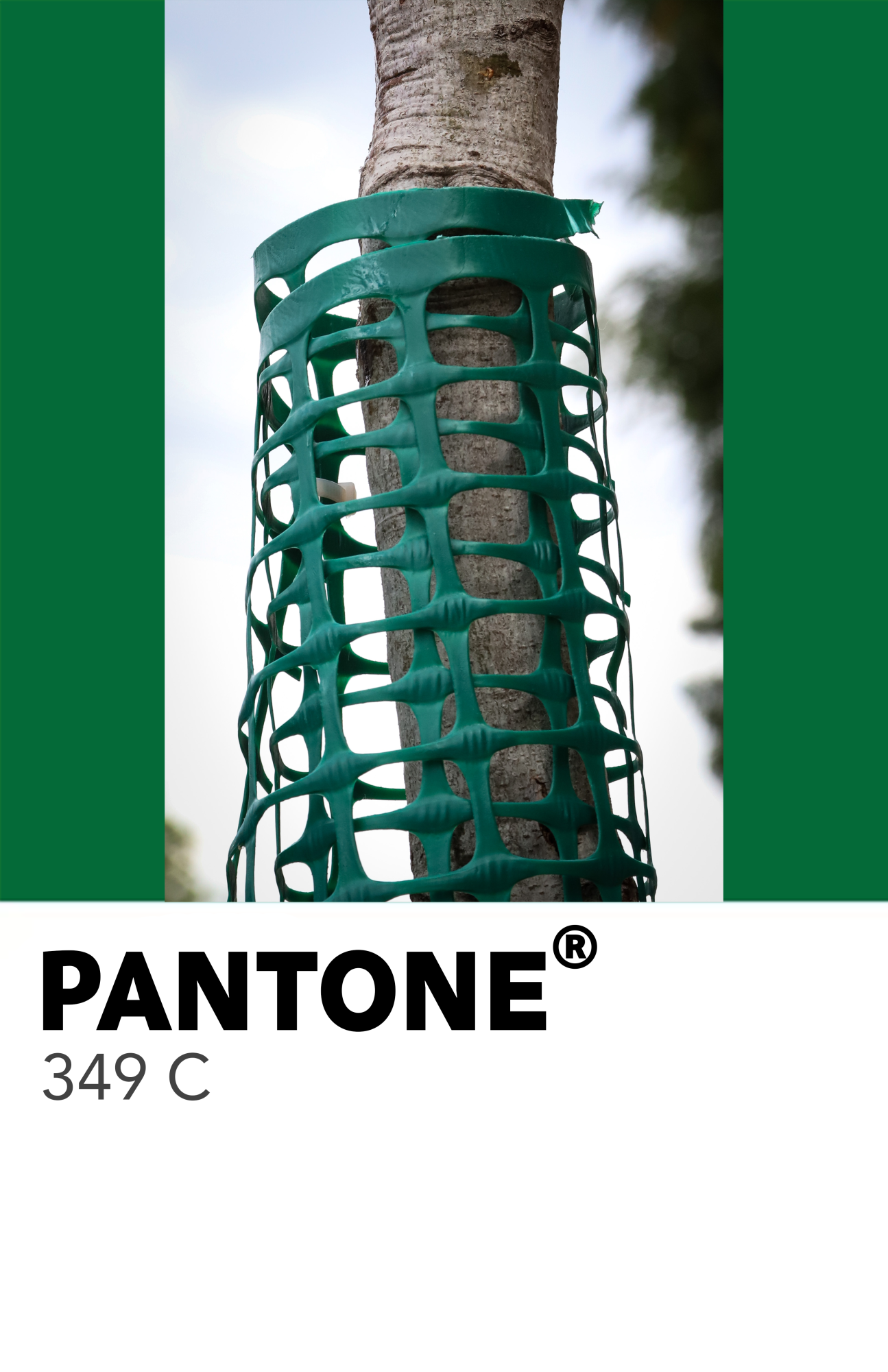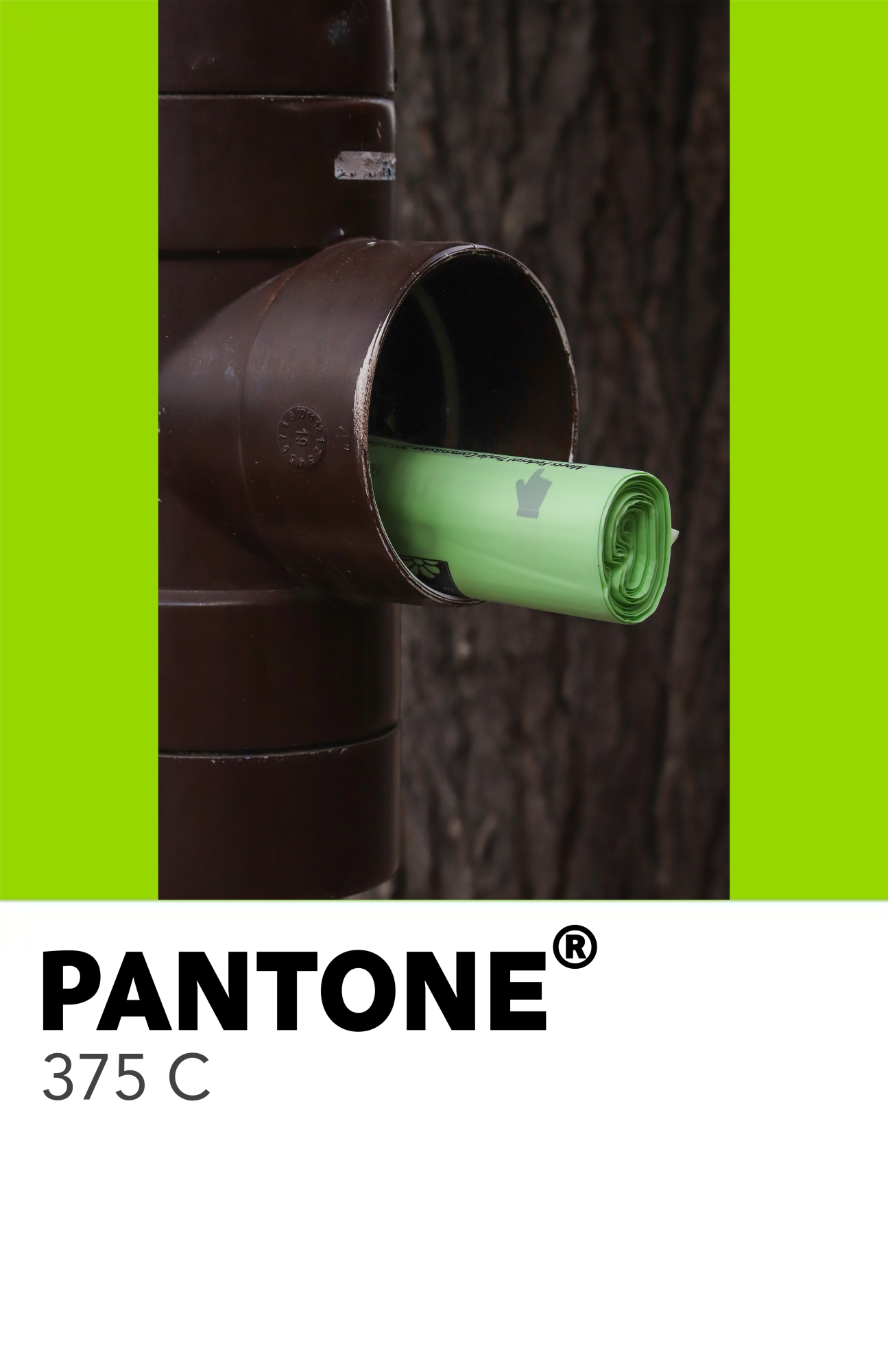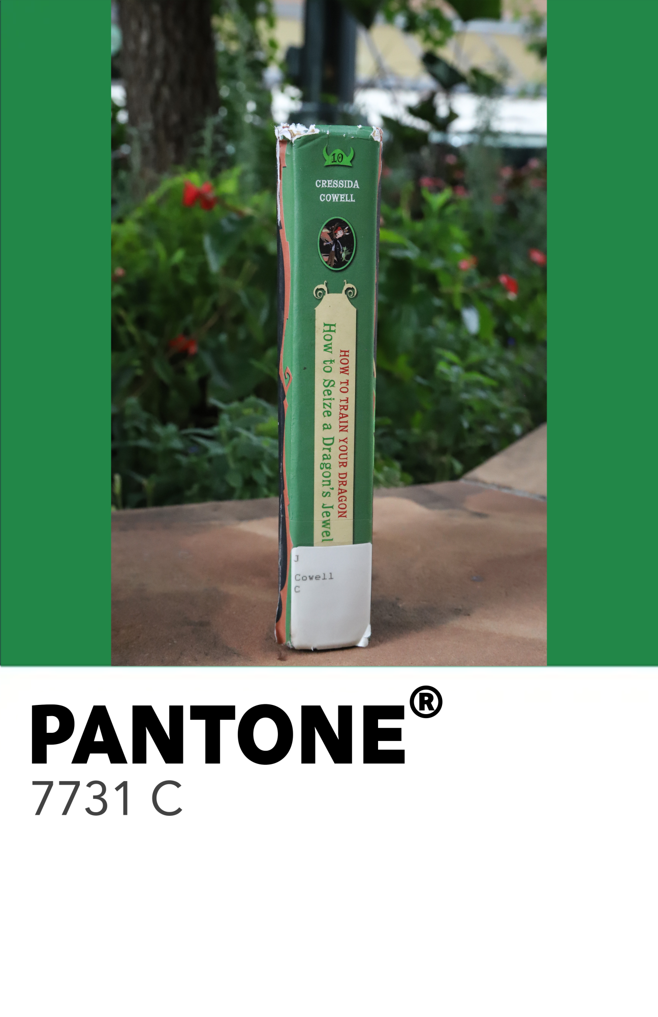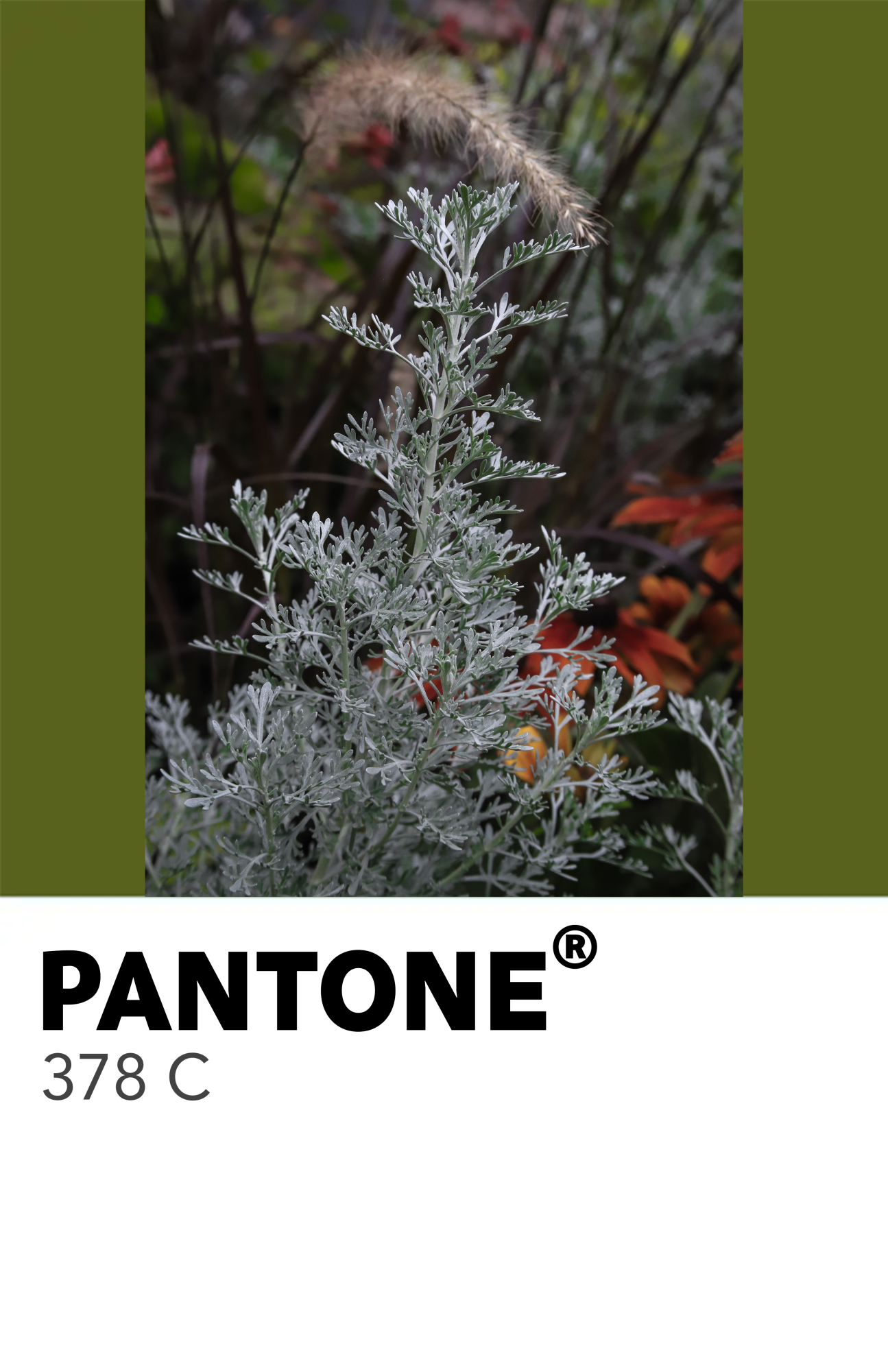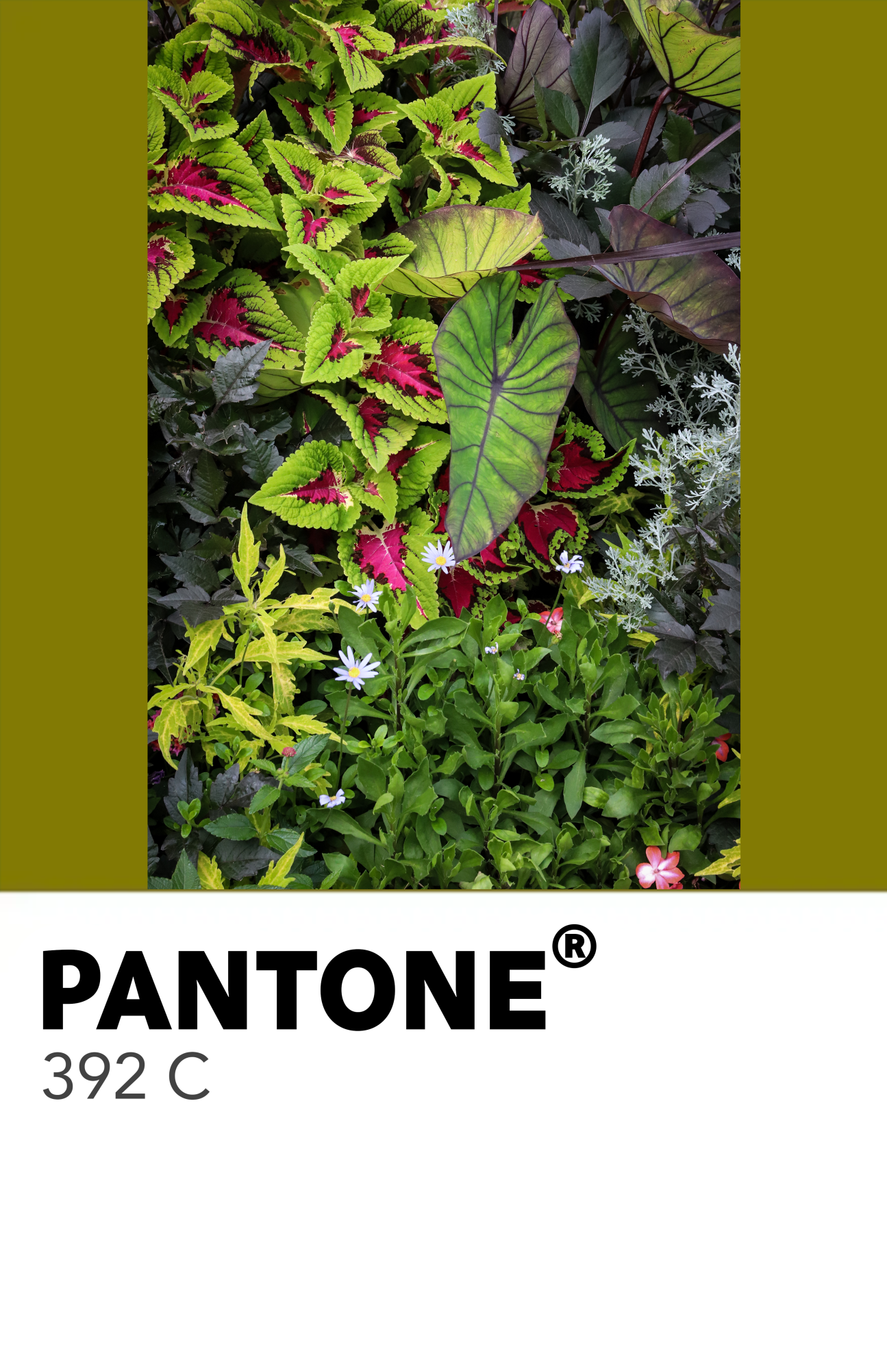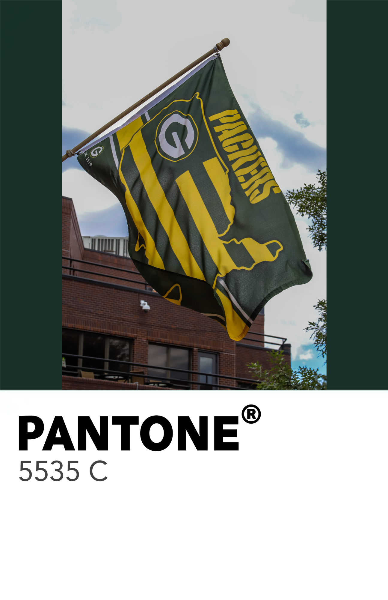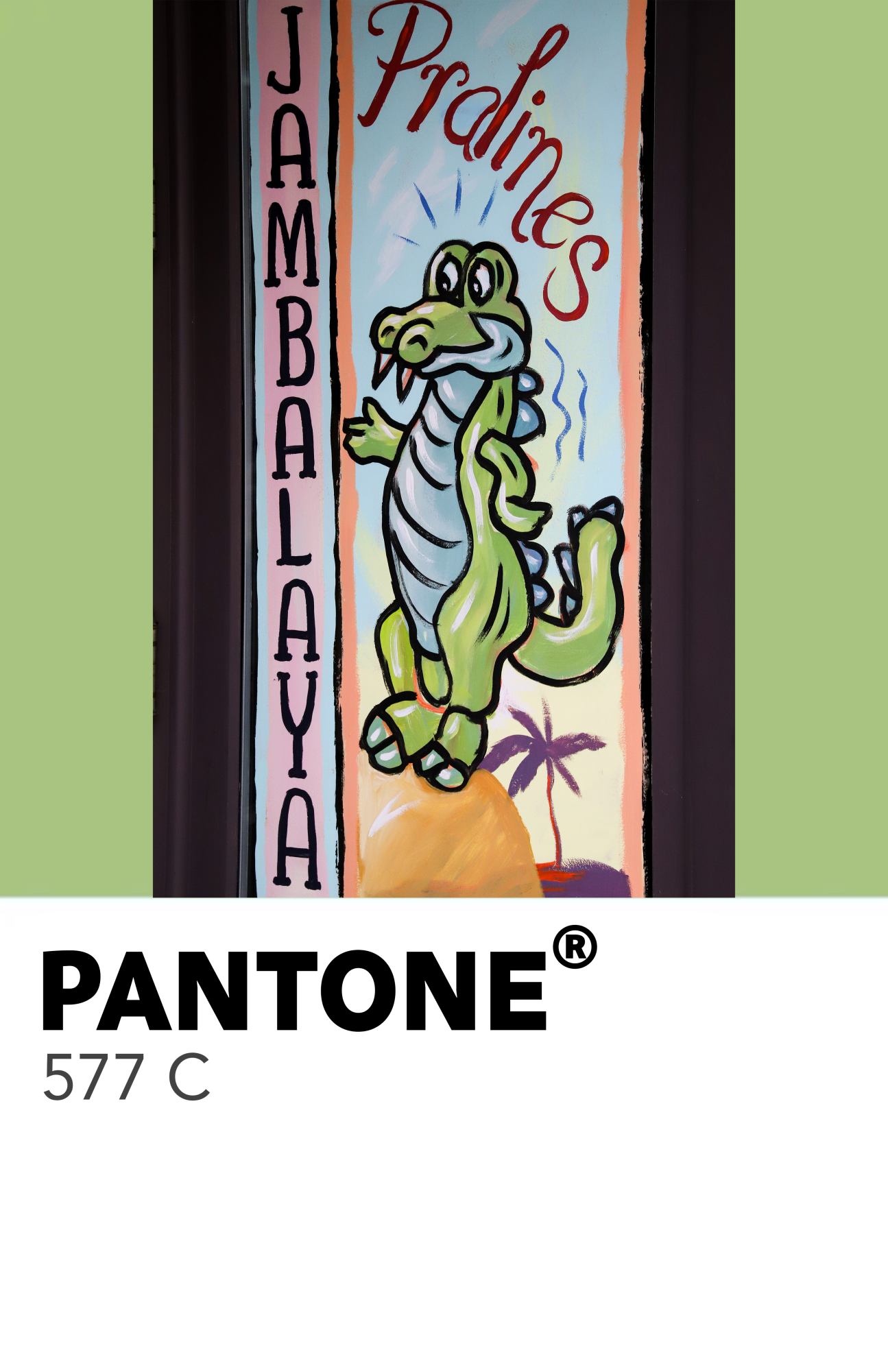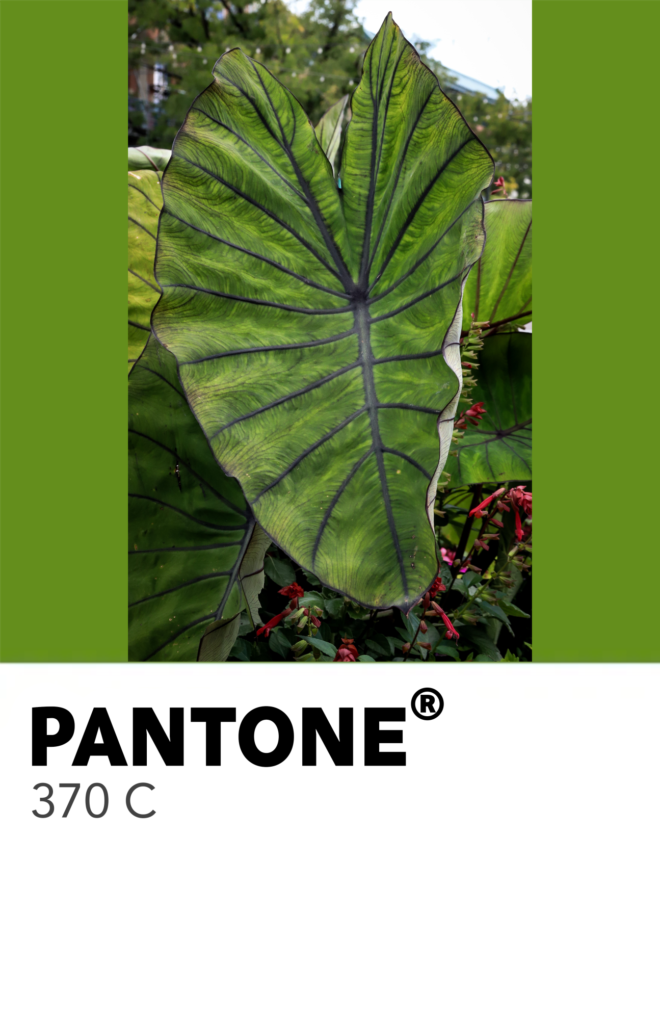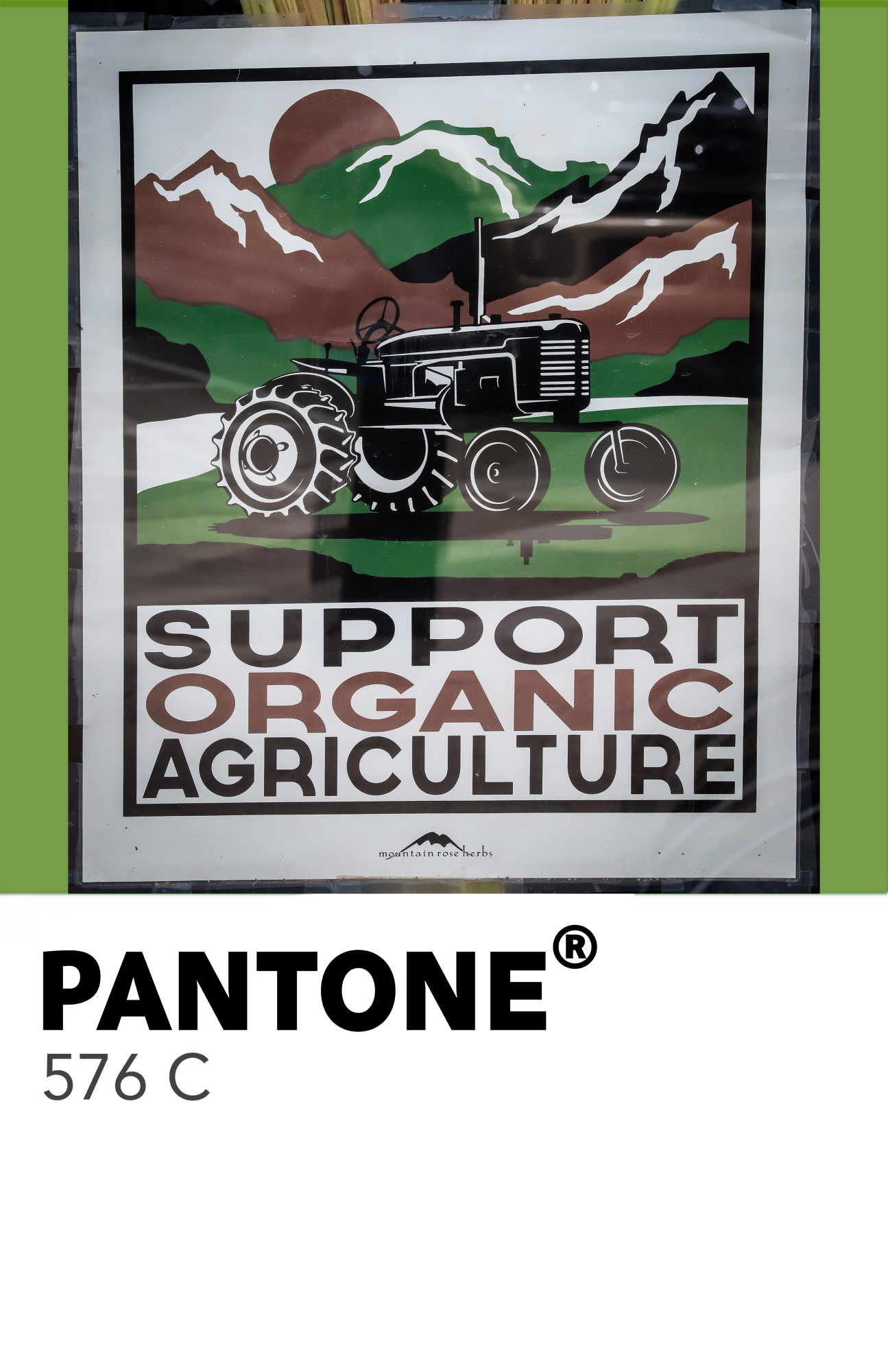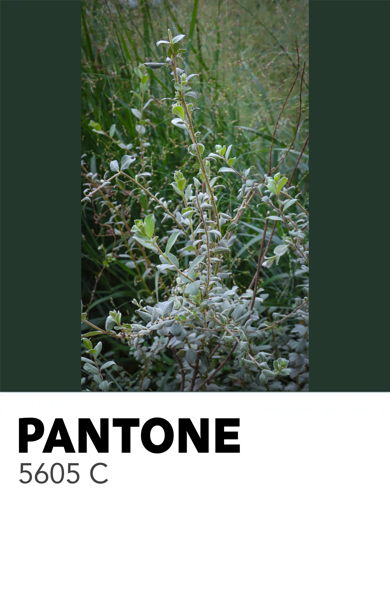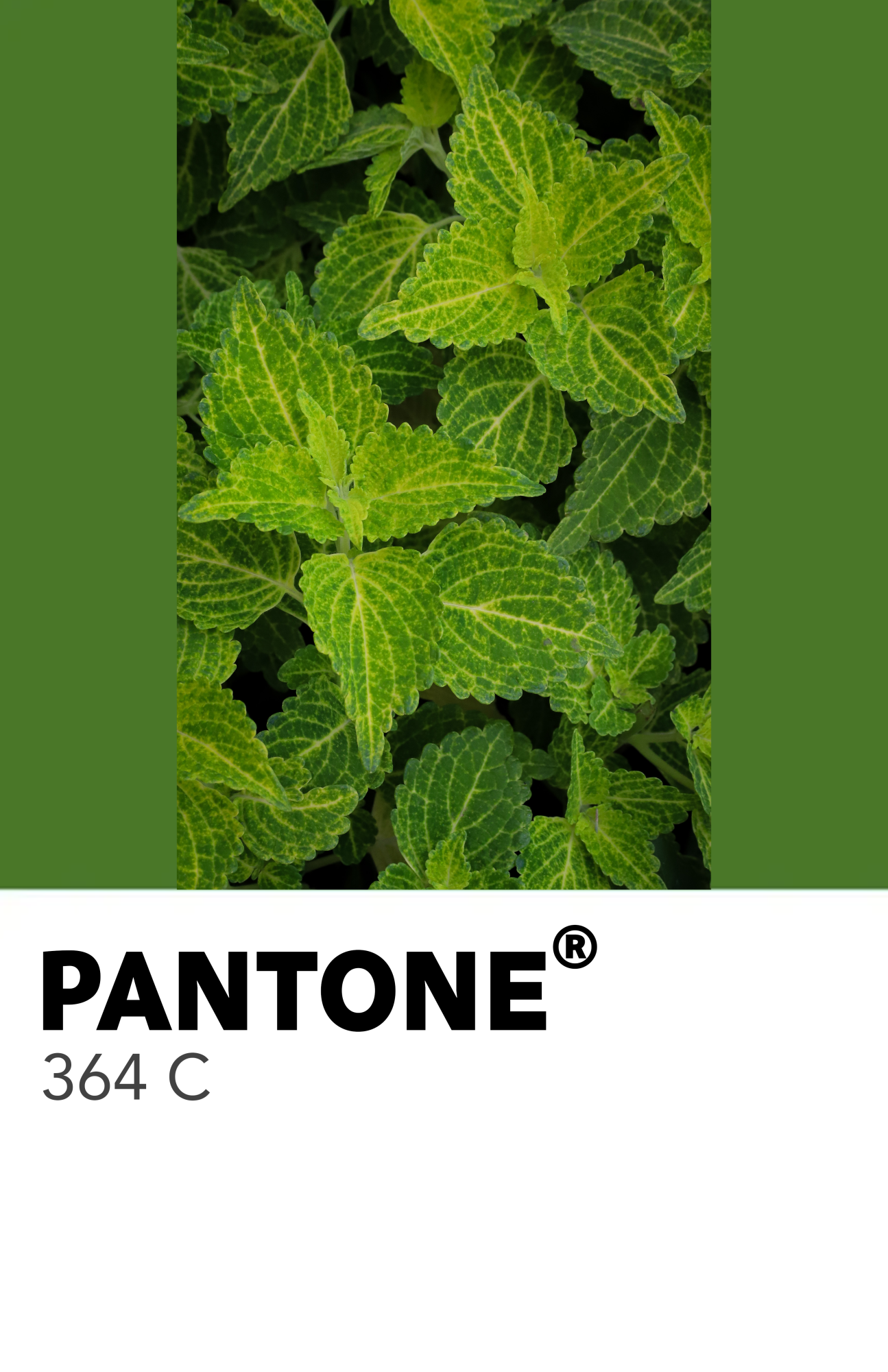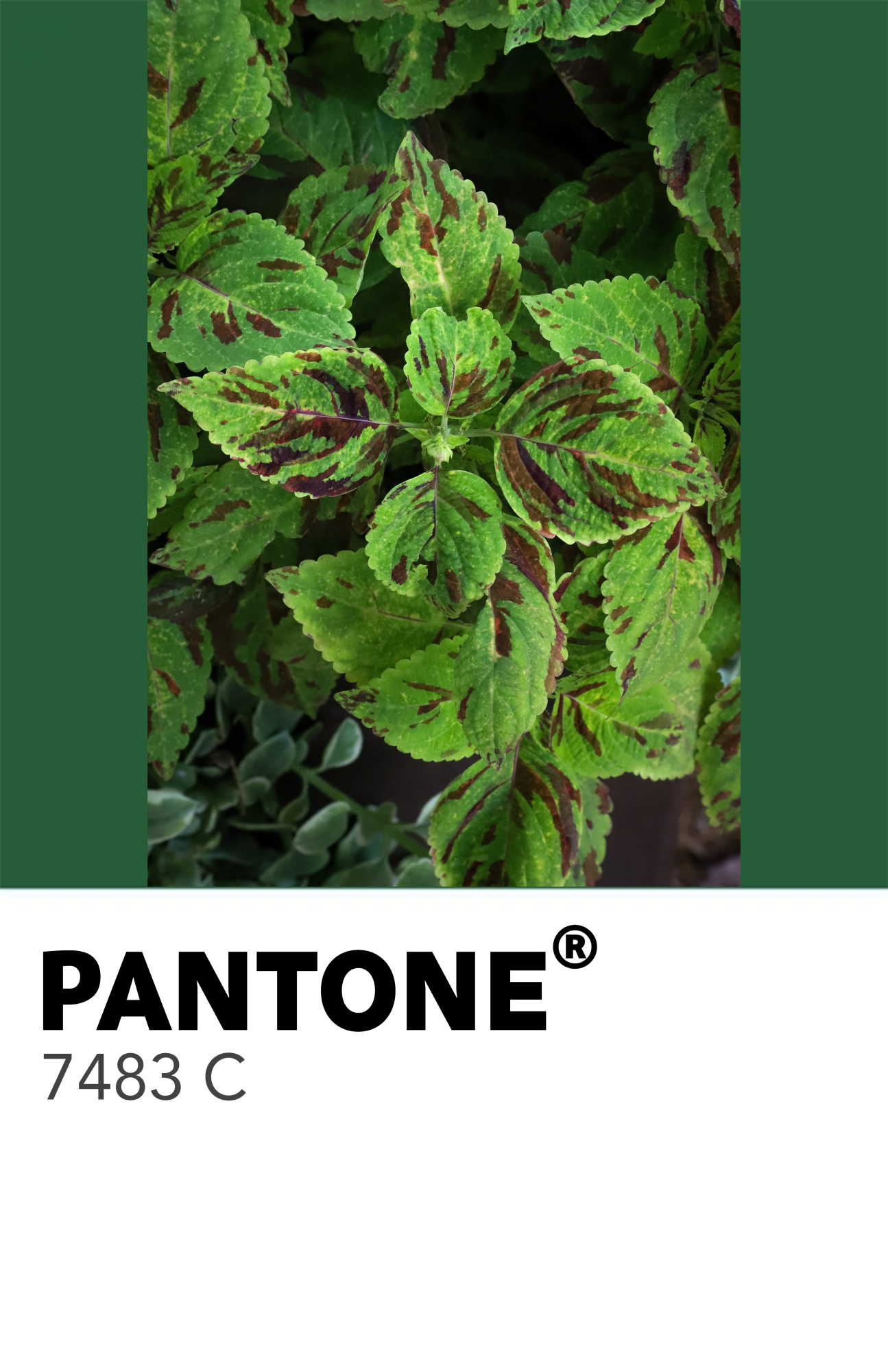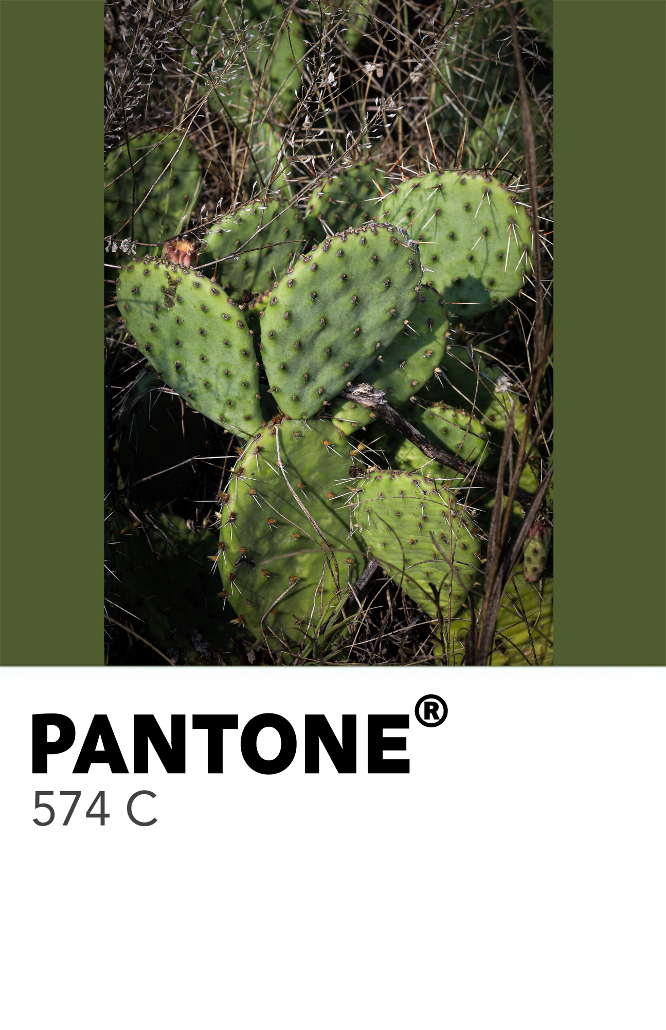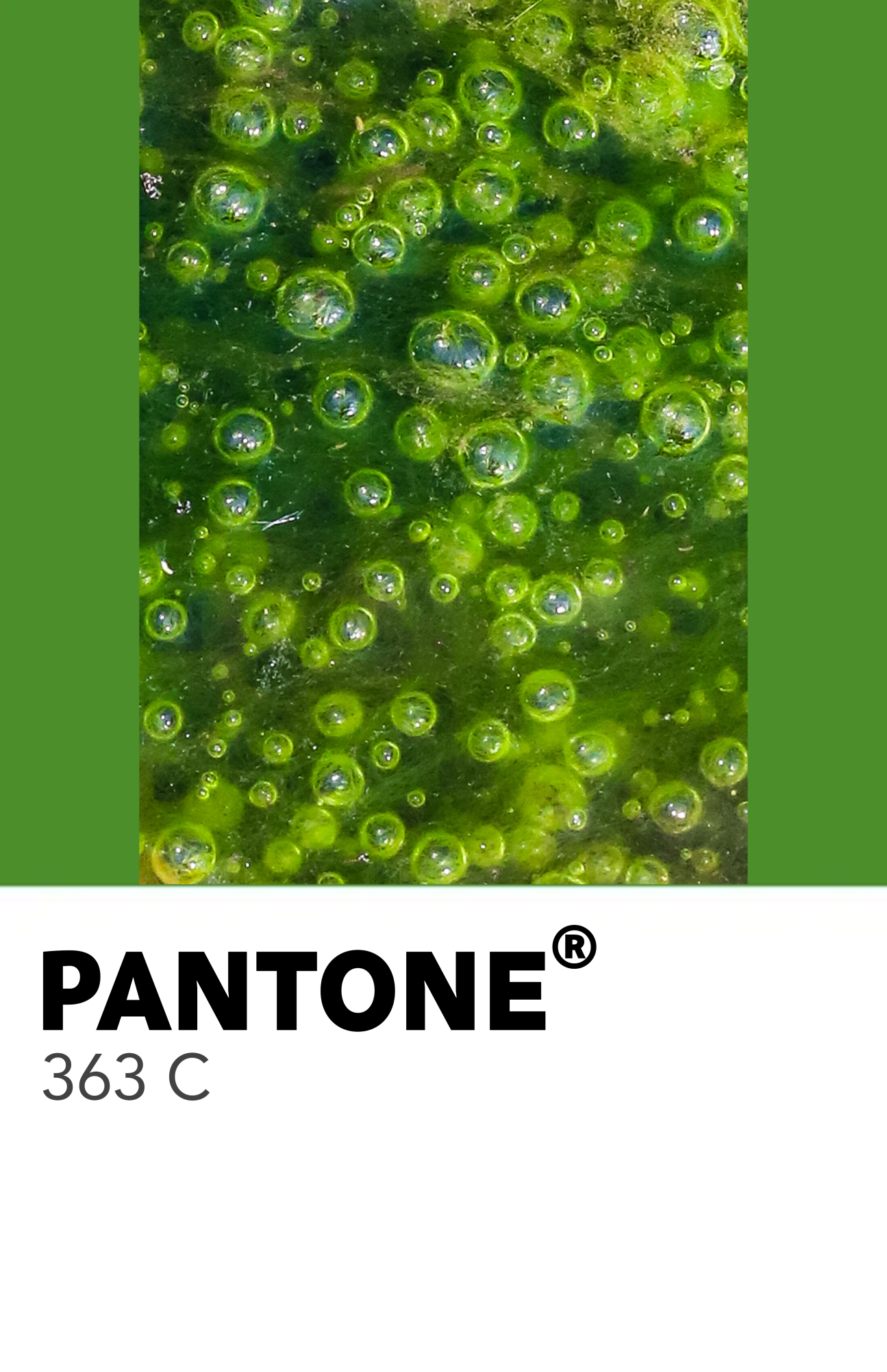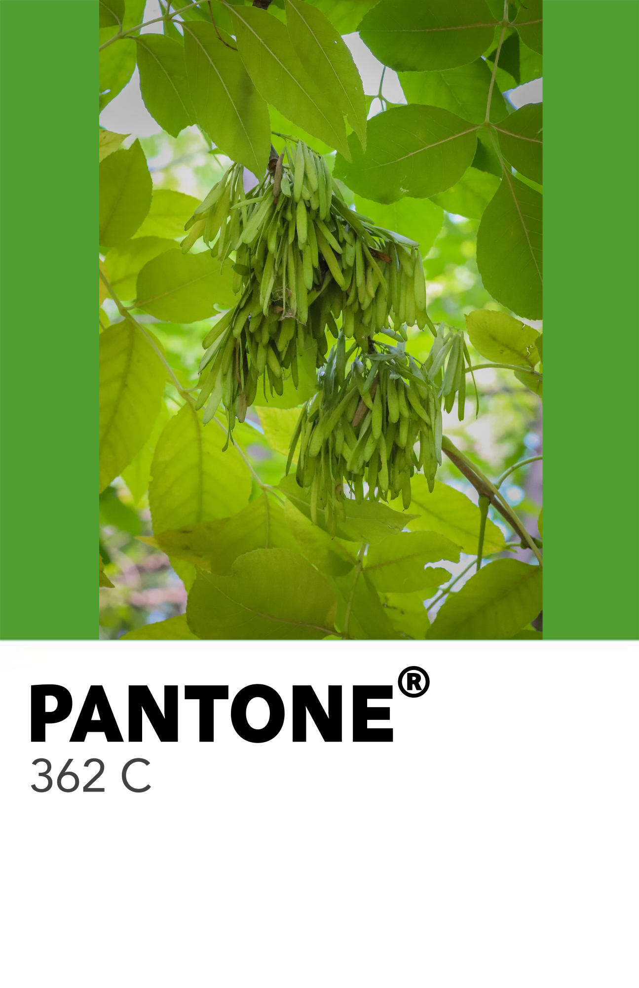


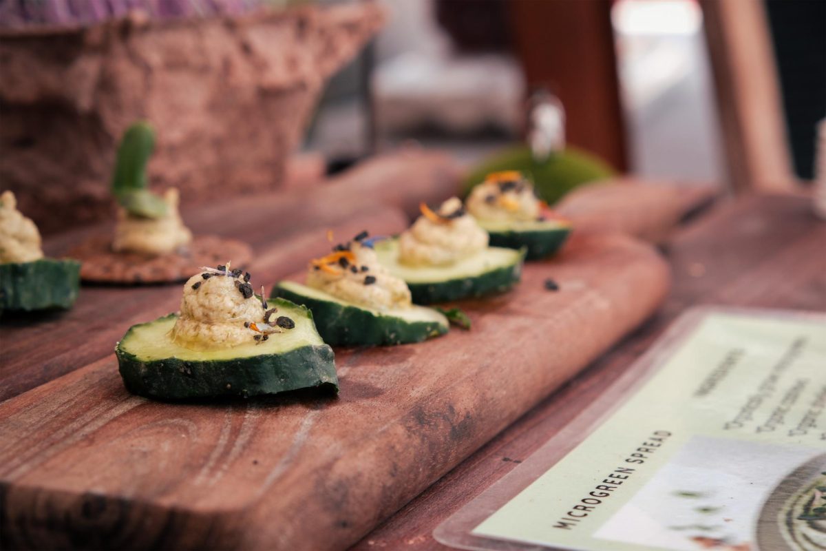
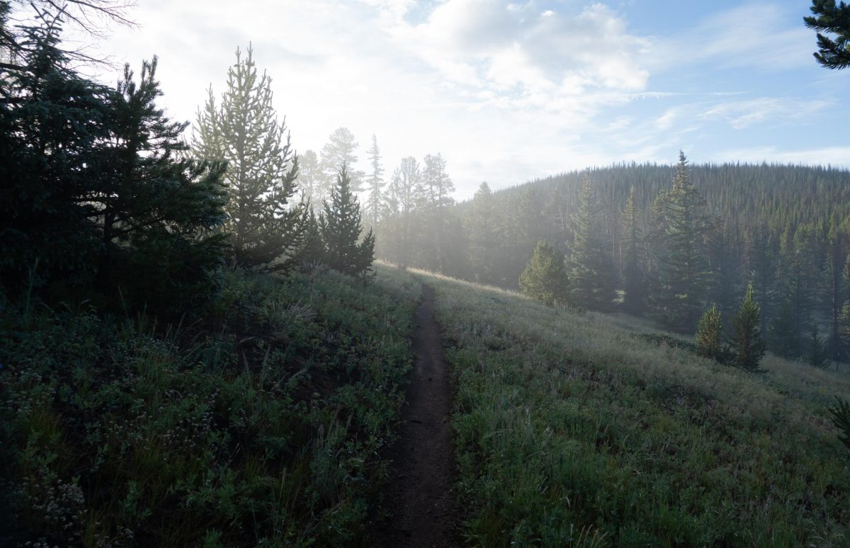


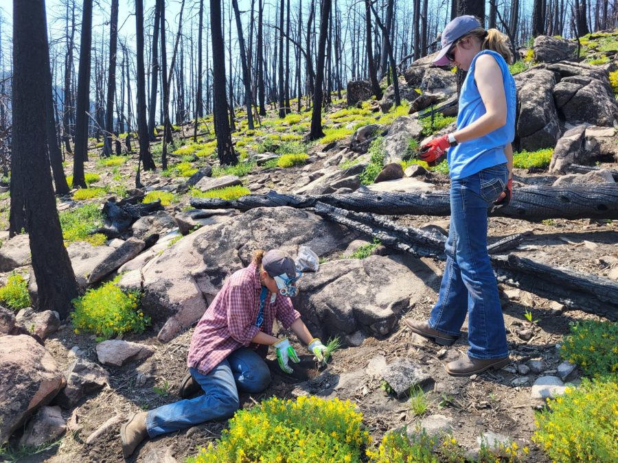


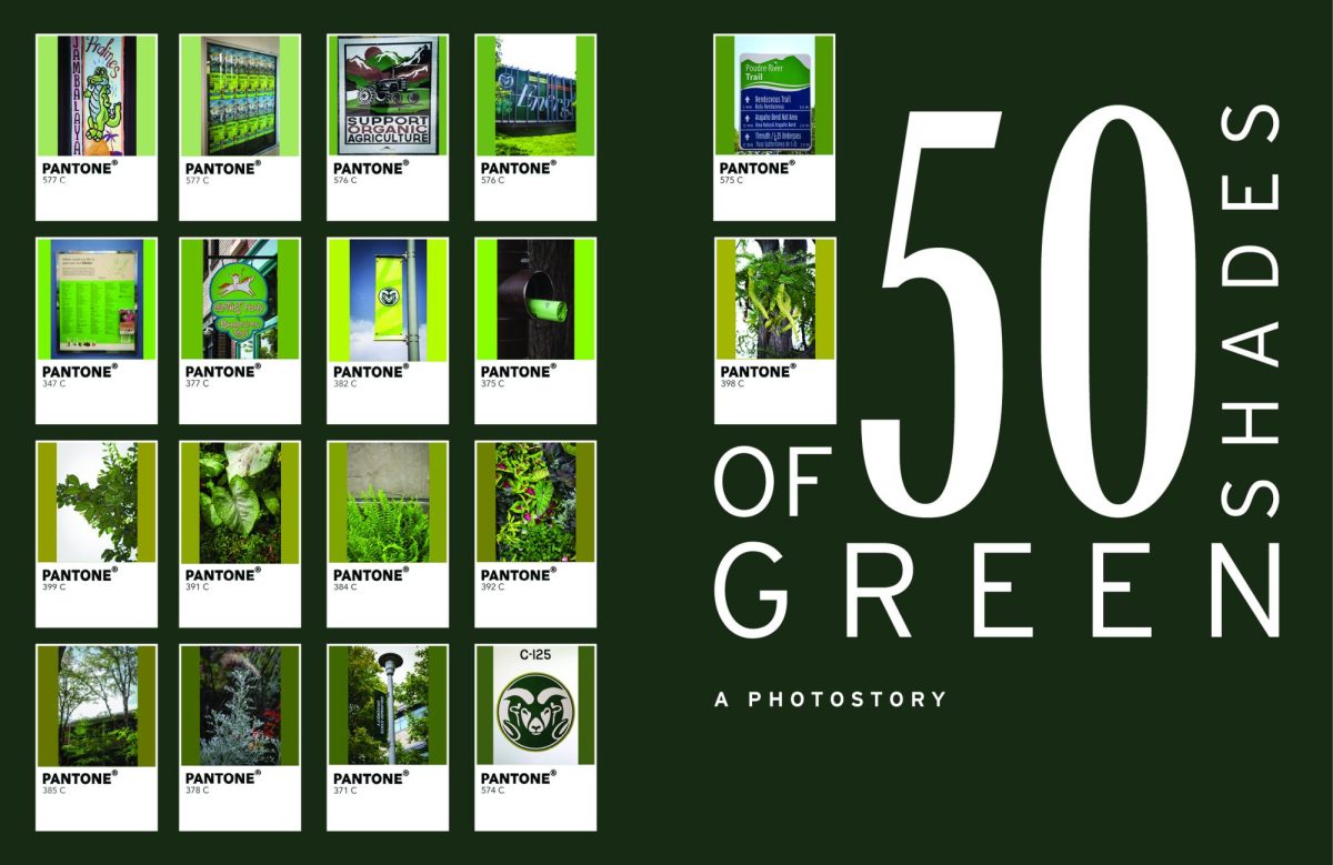
The color green surrounds us. It’s in the perfectly curated Fort Collins foliage, the artwork, and of course, on Colorado State University’s campus. That said, does anyone ever stop to think about how many shades of green there truly are? Throughout the week, I made it my mission to go around Fort Collins and photograph anything green. From leaves and grass to sculptures and books, I found that it was a lot easier than I thought to find such a broad variety of shades. Compiling the images I had gotten from around town, I used AI to extract the red, green and blue values from the pixels in each photograph and compare it to a database of Pantone colors. Pantone is recognized as the standard for designers and brands, at least when it comes to color. The Pantone Matching System (PMS), created in 1963 by Lawrence Herbert, assigns each color a unique number, making sure that there is a framework for consistency throughout different brands. Using the values that AI pulled, I had the system find the closest match to individual Pantone colors as possible, using the average green color in each photograph. I was particularly inspired by the Brazilian photographer Angélica Dass. She created a photographic work titled Humanæ, where she matched her subjects’ skin tone to a Pantone color. While hers is more of a square with just a small Pantone code underneath, I wanted my photographs to present more paint chip-like, the small pieces of paper that you use to decide what color to paint, say, your bedroom wall. Using Photoshop, I was able to match the photographs to their corresponding Pantone color and put them together as one. I felt that presenting the photographs like this, although time consuming, was more visually appealing and really represented the different shades of green found throughout Fort Collins. So next time you’re taking a stroll through the park, slow down and take a look around. I’m sure there are fifty shades of green or more, all around you.